INTRODUCTION

TRANSITION
CLARIANT PIGMENTS
AND HEUBACH MERGE
INTO A PIGMENT
POWERHOUSE
DEDICATED TO GLOBAL
RESPONSIBILITY
AND FAIRNESS
SUDARSHAN & HEUBACH
ARE NOW ONE COMPANY
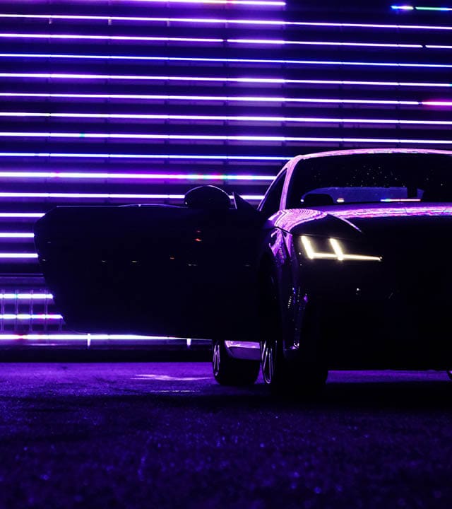
Transitions are a necessary part of life, be it in
relationships, business, or civilization as a whole.
The key to mastering them is to turn them into opportunities: for new forms of cooperation, for
new types of innovation and, ultimately, for new
and better kinds of growth.
Merging two businesses can be just as challenging as merging two families or integrating new sources of energy into existing economic patterns. But the rewards, too, can be just as high. For the businesses themselves, for their managements, R&D experts and manufacturing teams – and of course for their customers.
When Clariant Pigments and Heubach merged, market analysts mainly saw it as the birth of the world’s biggest pigment provider. While this is true and by no means irrelevant, at a more basic level, something much simpler happened: People who love pigments joined hands and started working together as one – to offer Sudarshan’s customers beautiful, well-made and sustainable colors.

INTRODUCTION
TRANSITION
CLARIANT PIGMENTS
AND HEUBACH MERGE
INTO A PIGMENT
POWERHOUSE
DEDICATED TO GLOBAL
RESPONSIBILITY
AND FAIRNESS
Transitions are a necessary part of life, be it in relationships, business, or civilization as a whole. The key to mastering them is to turn them into opportunities: for new forms of cooperation, for new types of innovation and, ultimately, for new and better kinds of growth.
Merging two businesses can be just as challenging as merging two families or integrating new sources of energy into existing economic patterns. But the rewards, too, can be just as high. For the businesses themselves, for their managements, R&D experts and manufacturing teams – and of course for their customers.
When Clariant Pigments and Heubach merged, market analysts mainly saw it as the birth of the world’s biggest pigment provider. While this is true and by no means irrelevant, at a more basic level, something much simpler happened: People who love pigments joined hands and started working together as one – to offer Heubach’s customers beautiful, well-made and sustainable colors.


INTRODUCTION
TRANSITION
CLARIANT
PIGMENTS
AND HEUBACH
MERGE INTO
A PIGMENT
POWERHOUSE
DEDICATED
TO GLOBAL
RESPONSIBILITY
AND FAIRNESS
Transitions are a necessary part of life, be it in relationships, business, or civilization as a whole. The key to mastering them is to turn them into opportunities: for new forms of cooperation, for new types of innovation and, ultimately, for new and better kinds of growth.
Merging two businesses can be just as challenging as merging two families or integrating new sources of energy into existing economic patterns. But the rewards, too, can be just as high. For the businesses themselves, for their managements, R&D experts and manufacturing teams – and of course for their customers.
When Clariant Pigments and Heubach merged, market analysts mainly saw it as the birth of the world’s biggest pigment provider. While this is true and by no means irrelevant, at a more basic level, something much simpler happened: People who love pigments joined hands and started working together as one – to offer Heubach’s customers beautiful, well-made and sustainable colors.


THERE IS NO PLANET B


THERE IS NO
PLANET B
Time to
switch to
plan B for
planet A


We go through life with the reassuring knowledge that we can have whatever we want, from unlimited supply, and that things that break can either be repaired or simply replaced. This is true for smaller items like dishes, eyeglasses, or worn-out shoes. Even if our car breaks down in a way that can’t be mended, there’s always the possibility of getting a new one.
This voracious consumption of resources, along with carelessly neglecting environmental, social, and ethical affairs, is typical »plan A« ideology we have been used to for all too long.
However, when it comes to our planet, which some of us affectionately like to call Mother Earth, this thinking doesn’t work.
There is no super glue we can put Earth back together with. No shoe repairs shop we can take it to. No trusted mechanic who will take a knowing look under its hood. There is also no cosmic department store, online shop, or Earth dealership where we can simply get a new one.
There is just this one: our planet A. Space scientists say there might be many more just like it out there. But until we’ve found a way of reaching them that’s neither here nor there. No, for the time being we seem to be stuck with the one we have and can’t pin our hopes on planet B. And that’s why, to take better care of it and keep it in good shape, it’s time for all of us to switch to »plan B«.
THERE IS NO PLANET B


THERE IS NO
PLANET B
Time to
switch to
plan B for
planet A
We go through life with the reassuring knowledge that we can have whatever we want, from unlimited supply, and that things that break can either be repaired or simply replaced. This is true for smaller items like dishes, eyeglasses, or worn-out shoes. Even if our car breaks down in a way that can’t be mended, there’s always the possibility of getting a new one.
This voracious consumption of resources, along with carelessly neglecting environmental, social, and ethical affairs, is typical »plan A« ideology we have been used to for all too long.
However, when it comes to our planet, which some of us affectionately like to call Mother Earth, this thinking doesn’t work.
There is no super glue we can put Earth back together with. No shoe repairs shop we can take it to. No trusted mechanic who will take a knowing look under its hood. There is also no cosmic department store, online shop, or Earth dealership where we can simply get a new one.
There is just this one: our planet A. Space scientists say there might be many more just like it out there. But until we’ve found a way of reaching them that’s neither here nor there. No, for the time being we seem to be stuck with the one we have and can’t pin our hopes on planet B. And that’s why, to take better care of it and keep it in good shape, it’s time for all of us to switch to »plan B«.


Switching to plan B means we must urgently find, explore, and pursue new ways of thinking, living, and behaving, and this may seem scary at first. But like any type of change, following plan B for planet A is also full of opportunities.
The opportunities lie in progressive concepts like green energy, digitalization, and fair trade. Though often still in a fledgling state, they have the potential to not just save the planet. They can also do a lot to make our daily lives on this planet safer and better – including the way we drive, paint, and enjoy our cars. Ultimately, switching to plan B may even take us a big step forward to justice, peace, and freedom on our planet A.
THERE IS NO PLANET B
Time to switch
to plan B
for planet A


Switching to plan B means we must urgently find, explore, and pursue new ways of thinking, living, and behaving, and this may seem scary at first. But like any type of change, following plan B for planet A is also full of opportunities.
The opportunities lie in progressive concepts like green energy, digitalization, and fair trade. Though often still in a fledgling state, they have the potential to not just save the planet. They can also do a lot to make our daily lives on this planet safer and better – including the way we drive, paint, and enjoy our cars. Ultimately, switching to plan B may even take us a big step forward to justice, peace, and freedom on our planet A.
THERE IS NO
PLANET B
Time to
switch to plan B for
planet A

THE SEA


THE BEAUTIFUL
COLORS
of sea
and nature
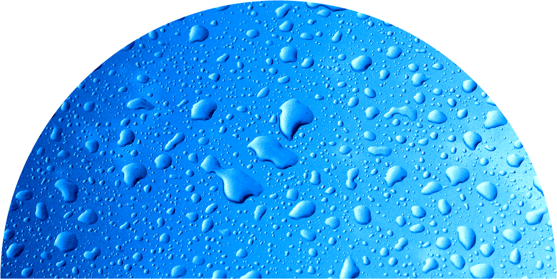
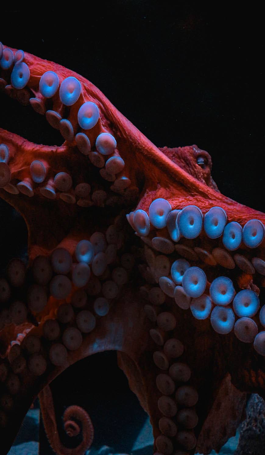
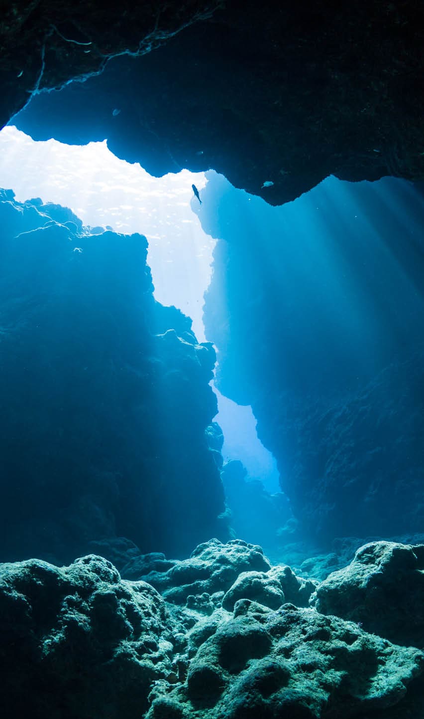
To know where you’re going, you must know where you come from. We, and maybe all living things on Earth, come from the sea. When, long ago, our fishlike ancestors moved onto land and started walking on their fins, it set the stage for a world of boundless biodiversity. And wherever we walk on our former fins and whatever new paths we follow: The sea remains our home.
The sea is also home to a beautiful universe of colors. From corals to anemones to parrot fish: Tropical reefs harbor a swirling diversity of hues that rival the most extravagant tones of an automotive coatings show. Yet reefs also serve as a literal color test for climate change, bleaching and fading when oceans get too warm.
At the same time, new flecks of color wash up on beaches and other unwanted places – made of mismanaged marine debris. Marine coatings, too, can add to the oceans’ load when their binders release toxic ingredients by design or become brittle and flake off into the sea. That’s why the coatings should not only be of high quality but their ingredients as sustainable as possible.
Meanwhile, coatings also play an essential role in protecting the hulls of ships and other marine surfaces, extending their life and the time they can be used in a circular economy. It’s a sustainable role coatings play not just in global transportation but also in the realm of science – where deep-sea submersibles explore more and more of our beautiful ocean home.
THE SEA

THE BEAUTIFUL
COLORS
of sea
and nature
To know where you’re going, you must know where you come from. We, and maybe all living things on Earth, come from the sea. When, long ago, our fishlike ancestors moved onto land and started walking on their fins, it set the stage for a world of boundless biodiversity. And wherever we walk on our former fins and whatever new paths we follow: The sea remains our home.
The sea is also home to a beautiful universe of colors. From corals to anemones to parrot fish: Tropical reefs harbor a swirling diversity of hues that rival the most extravagant tones of an automotive coatings show. Yet reefs also serve as a literal color test for climate change, bleaching and fading when oceans get too warm.
At the same time, new flecks of color wash up on beaches and other unwanted places – made of mismanaged marine debris. Marine coatings, too, can add to the oceans’ load when their binders release toxic ingredients by design or become brittle and flake off into the sea. That’s why the coatings should not only be of high quality but their ingredients as sustainable as possible.
Meanwhile, coatings also play an essential role in protecting the hulls of ships and other marine surfaces, extending their life and the time they can be used in a circular economy. It’s a sustainable role coatings play not just in global transportation but also in the realm of science – where deep-sea submersibles explore more and more of our beautiful ocean home.

THE SEA


THE BEAUTIFUL
COLORS
of sea
and nature
To know where you’re going, you must know where you come from. We, and maybe all living things on Earth, come from the sea. When, long ago, our fishlike ancestors moved onto land and started walking on their fins, it set the stage for a world of boundless biodiversity. And wherever we walk on our former fins and whatever new paths we follow: The sea remains our home.
The sea is also home to a beautiful universe of colors. From corals to anemones to parrot fish: Tropical reefs harbor a swirling diversity of hues that rival the most extravagant tones of an automotive coatings show. Yet reefs also serve as a literal color test for climate change, bleaching and fading when oceans get too warm.
At the same time, new flecks of color wash up on beaches and other unwanted places – made of mismanaged marine debris. Marine coatings, too, can add to the oceans’ load when their binders release toxic ingredients by design or become brittle and flake off into the sea. That’s why the coatings should not only be of high quality but their ingredients as sustainable as possible.
Meanwhile, coatings also play an essential role in protecting the hulls of ships and other marine surfaces, extending their life and the time they can be used in a circular economy. It’s a sustainable role coatings play not just in global transportation but also in the realm of science – where deep-sea submersibles explore more and more of our beautiful ocean home.


THE BEAUTIFUL
COLORS
of sea
and nature


THE BEAUTIFUL
COLORS
of sea
and nature


THE BEAUTIFUL
COLORS
of sea
and nature

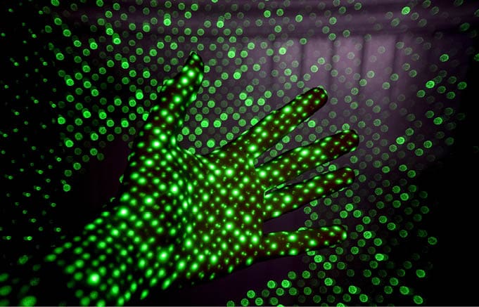
DIGITALIZATION

There may be no planet B in the real world. But in the digitized realms of virtual reality, there aren’t just planets B, C and D but more alternative worlds than any alphabet has letters. And, as the very page in front of you shows, digitalization can do far more than create a new »metaverse« of virtual games and recreations.
There’s nothing to be said against expanding our inner horizon by leading a colorful second life as an avatar. But perhaps even more interesting is how our new ability to create digital »twins« can help us solve our real-world challenges. Take these words you’re reading, for example. In the last edition of our Trendbook, they were still set in print, as were all the accompanying images and illustrations. In this edition, you are either reading them in a PDF or on our website, and thus in the »immaterial« form of pixels.
There are several reasons why we decided to take this step. And one of the foremost ones is sustainability. Being creators of highly real and touchable products ourselves, we sincerely appreciate the benefits of a printed book. Yet weighing these against the energy and resources saved by switching to »digital«, both when it comes
to manufacture and distribution,
we ultimately opted for change. It
is one of the many ways in which,
at Sudarshan, we try to preserve planet A by leveraging the benefits of digitalization.
HELPING PRESERVE
PLANET A
BY TAPPING
THE RESOURCES
OF UNIVERSE B
DIGITALIZATION
There may be no planet B in the real world. But in the digitized realms of virtual reality, there aren’t just planets B, C and D but more alternative worlds than any alphabet has letters. And, as the very page in front of you shows, digitalization can do far more than create a new »metaverse« of virtual games and recreations.
There’s nothing to be said against expanding our inner horizon by leading a colorful second life as an avatar. But perhaps even more interesting is how our new ability to create digital »twins« can help us solve our real-world challenges. Take these words you’re reading, for example. In the last edition of our Trendbook, they were still set in print, as were all the accompanying images and illustrations. In this edition, you are either reading them in a PDF or on our website, and thus in the »immaterial« form of pixels.
There are several reasons why we decided to take this step. And one of the foremost ones is sustainability. Being creators of highly real and touchable products ourselves, we sincerely appreciate the benefits of a printed book. Yet weighing these against the energy and resources saved by switching to »digital«, both when it comes to manufacture and distribution,
we ultimately opted for change. It
is one of the many ways in which,
at Heubach, we try to preserve planet A by leveraging the benefits of digitalization.
HELPING PRESERVE
PLANET A
BY TAPPING
THE RESOURCES
OF UNIVERSE B

DIGITALIZATION

HELPING
PRESERVE
PLANET A
BY TAPPING
THE RESOURCES
OF UNIVERSE B


HELPING PRESERVE
PLANET A
BY TAPPING
THE RESOURCES
OF UNIVERSE B


DIGITALIZATION MEANS DEMATERIALIZATION AND, THUS, DECARBONIZATION:
Both our digital trendbook and virtual car color configurator help save CO₂. »Digital« also helps
us trace our sustainable
raw materials.


HELPING PRESERVE
PLANET A
BY TAPPING
THE RESOURCES
OF UNIVERSE B
DIGITALIZATION MEANS DEMATERIALIZATION AND, THUS, DECARBONIZATION:
Both our digital trendbook and virtual car color configurator help save CO₂. »Digital« also helps
us trace our sustainable
raw materials.


HELPING
PRESERVE
PLANET A
BY TAPPING
THE RESOURCES
OF UNIVERSE B
DIGITALIZATION
MEANS DEMATERIALIZATION AND, THUS, DECARBONIZATION:
Both our digital trendbook and virtual car color configurator help save CO₂. »Digital« also helps us trace our sustainable raw materials.


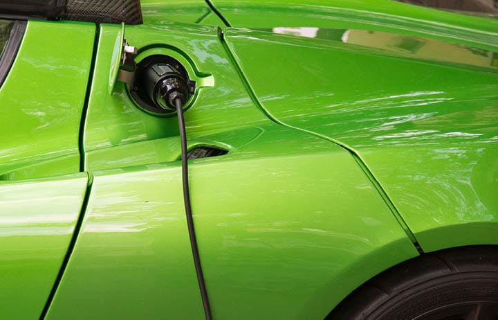
GREEN ERNERGY


GREEN ENERGY
FOR EVERYONE
THE BASIS
OF ANY
PLAN B
While digitalization can be a real alternative to using precious resources, it still requires energy – often even a lot of it. That’s why it’s so crucial that green energy becomes widely available across planet A: whether it’s used for running computers, cars or the production of pigments and paints.
Some of the most high-flying ideas for generating green energy include harvesting wind power at high altitudes and solar power in outer space. Meanwhile, down here on Earth, global sales of electric cars are finally taking off. According to estimates from the International Energy Agency, 13% of all new cars sold in 2022 were electric. If the trend holds, cars may reach the lofty goal of net-zero emissions by 2050.*
Another hot contender for paving the road to net-zero is hydrogen. To do so, however, the versatile energy carrier must be much more widely produced using green energy, such as solar, wind or water power. At the same time, all these sustainable advances must become more generally available to all societies and income levels to really keep us from wishing we had a planet B.

* IEA, Electric Vehicles, September 2022
GREEN ERNERGY

GREEN ENERGY
FOR EVERYONE
THE BASIS
OF ANY
PLAN B
While digitalization can be a real alternative to using precious resources, it still requires energy – often even a lot of it. That’s why it’s so crucial that green energy becomes widely available across planet A: whether it’s used for running computers, cars or the production of pigments and paints.
Some of the most high-flying ideas for generating green energy include harvesting wind power at high altitudes and solar power in outer space. Meanwhile, down here on Earth, global sales of electric cars are finally taking off. According to estimates from the International Energy Agency, 13% of all new cars sold in 2022 were electric. If the trend holds, cars may reach the lofty goal of net-zero emissions by 2050.*
Another hot contender for paving the road to net-zero is hydrogen. To do so, however, the versatile energy carrier must be much more widely produced using green energy, such as solar, wind or water power. At the same time, all these sustainable advances must become more generally available to all societies and income levels to really keep us from wishing we had a planet B.
* IEA, Electric Vehicles, September 2022
GREEN ERNERGY


GREEN ENERGY
FOR EVERYONE
THE BASIS
OF ANY
PLAN B
While digitalization can be a real alternative to using precious resources, it still requires energy – often even a lot of it. That’s why it’s so crucial that green energy becomes widely available across planet A: whether it’s used for running computers, cars or the production of pigments and paints.
Some of the most high-flying ideas for generating green energy include harvesting wind power at high altitudes and solar power in outer space. Meanwhile, down here on Earth, global sales of electric cars are finally taking off. According to estimates from the International Energy Agency, 13% of all new cars sold in 2022 were electric. If the trend holds, cars may reach the lofty goal of net-zero emissions by 2050.*
Another hot contender for paving the road to net-zero is hydrogen. To do so, however, the versatile energy carrier must be much more widely produced using green energy, such as solar, wind or water power. At the same time, all these sustainable advances must become more generally available to all societies and income levels to really keep us from wishing we had a planet B.
* IEA, Electric Vehicles, September 2022

GREEN ENERGY
FOR EVERYONE
THE BASIS
OF ANY
PLAN B
GREEN ENERGY
FOR EVERYONE
THE BASIS
OF ANY
PLAN B
GREEN ENERGY
FOR EVERYONE
THE BASIS
OF ANY
PLAN B


TAKING
A BEE-LINE
to the
future


TAKING
A BEE-LINE
to the
future


TAKING
A BEE-LINE
to the
future
SAFETY


HOW SAVING
THE PLANET
creates
better safety
in every sense
* C&EN, How your gut might modify your mind, 2019

Wind, sea, heat & fire: The enormous energy the forces of nature hold can turn against us if we don’t put the world back in balance. Being more mindful of life and nature’s needs can also increase our safety and well-being in other respects.
Scientists are just finding out that what we eat, and the way the microbes in our gut digest it, might not just influence our health but how we think, feel and act.* More reason to pay closer attention to how we grow, raise, and process our food, because what goes in there has even greater relevance for our physical and mental well-being than ever imagined.
In the mobility sector, green innovations in how cars are powered go hand in hand with advances in vehicle safety –
such as driver assist technology, pedestrian detection and 360° camera views. In mobility, too, the ingredients that go into materials become increasingly important, whether used on the in- or exterior.
At Sudarshan, we are proud to adhere to high standards in this respect, both regarding the production safety of our pigments and their safety in processing and use.


SAFETY


HOW SAVING
THE PLANET
creates
better safety
in every sense
* C&EN, How your gut might modify your mind, 2019

Wind, sea, heat & fire: The enormous energy the forces of nature hold can turn against us if we don’t put the world back in balance. Being more mindful of life and nature’s needs can also increase our safety and well-being in other respects.
Scientists are just finding out that what we eat, and the way the microbes in our gut digest it, might not just influence our health but how we think, feel and act.* More reason to pay closer attention to how we grow, raise, and process our food, because what goes in there has even greater relevance for our physical and mental well-being than ever imagined.
In the mobility sector, green innovations in how cars are powered go hand in hand with advances in vehicle safety – such as driver assist technology, pedestrian detection and 360° camera views. In mobility, too, the ingredients that go into materials become increasingly important, whether used on the in- or exterior.
At Heubach, we are proud to adhere to high standards in this respect, both regarding the production safety of our pigments and their safety in processing and use.


HOW SAVING
THE PLANET
creates
better safety
in every sense


HOW SAVING
THE PLANET
creates
better safety
in every sense


HOW SAVING
THE PLANET
creates
better safety
in every sense
FAIR TRADE


WHAT GLOBAL FAIR TRADE
has to do with
worldwide
sustainability
Saving planet A can only work if we all pitch in. And this kind of global solidarity can only be achieved if nobody feels left out or disrespected.
That’s why ensuring fair trade and work conditions across the globe is such a crucial part of organizing its rescue. Economic fairness starts with the abolition of child labor and exploitative work practices. It extends to closing pay and power gaps. And it includes a global financial system that provides a level playing field for all – be they citizens or societies. Only then can these be expected to all pull in the same direction and share in a global effort for the greater common good.
Equal access to mobility is part of this global fair deal. And equal doesn’t just mean being able to sort out some rudimentary, cumbersome, and perhaps even unsafe way of getting from A to B.
It can also mean enjoying the freedom, convenience and even the colorful means of self-expression that cars and other vehicles can represent. Always provided the joy they bring doesn’t put an excessive burden on the rest of society.
Sudarshan supports the United Nations Global Compact and its ten principles regarding human rights, labor, the environment and anti-corruption. We are also committed to the UN’s Sustainable Development Goals (SDGs) and engage to promote them with our business.

FAIR TRADE


WHAT GLOBAL FAIR TRADE
has to do with
worldwide
sustainability
Saving planet A can only work if we all pitch in. And this kind of global solidarity can only be achieved if nobody feels left out or disrespected.
That’s why ensuring fair trade and work conditions across the globe is such a crucial part of organizing its rescue. Economic fairness starts with the abolition of child labor and exploitative work practices. It extends to closing pay and power gaps. And it includes a global financial system that provides a level playing field for all – be they citizens or societies. Only then can these be expected to all pull in the same direction and share in a global effort for the greater common good.
Equal access to mobility is part of this global fair deal. And equal doesn’t just mean being able to sort out some rudimentary, cumbersome, and perhaps even unsafe way of getting from A to B.
It can also mean enjoying the freedom, convenience and even the colorful means of self-expression that cars and other vehicles can represent. Always provided the joy they bring doesn’t put an excessive burden on the rest of society.
Heubach supports the United Nations Global Compact and its ten principles regarding human rights, labor, the environment and anti-corruption. We are also committed to the UN’s Sustainable Development Goals (SDGs) and engage to promote them with our business.
FAIR TRADE


WHAT GLOBAL
AIR TRADE
has to do with
worldwide
sustainability
That’s why ensuring fair trade and work conditions across the globe is such a crucial part of organizing its rescue. Economic fairness starts with the abolition of child labor and exploitative work practices. It extends to closing pay and power gaps. And it includes a global financial system that provides a level playing field for all – be they citizens or societies. Only then can these be expected to all pull in the same direction and share in a global effort for the greater common good.
Equal access to mobility is part of this global fair deal. And equal doesn’t just mean being able to sort out some rudimentary, cumbersome, and perhaps even unsafe way of getting from A to B.
Saving planet A can only work if we all pitch in. And this kind of global solidarity can only be achieved if nobody feels left out or disrespected.
It can also mean enjoying the freedom, convenience and even the colorful means of self-expression that cars and other vehicles can represent. Always provided the joy they bring doesn’t put an excessive burden on the rest of society.
Heubach supports the United Nations Global Compact and its ten principles regarding human rights, labor, the environment and anti-corruption. We are also committed to the UN’s Sustainable Development Goals (SDGs) and engage to promote them with our business.


WHAT GLOBAL FAIR TRADE
has to do with
worldwide
sustainability


WHAT GLOBAL FAIR TRADE
has to do with
worldwide
sustainability


WHAT GLOBAL
FAIR TRADE
has to do with
worldwide
sustainability
FREEDOM


Freedom means liberty from oppression, aggression, and from other people telling you how to think, dress and behave.
In this regard, the fact that there is no planet B mainly means we should all do our best to get peacefully along on this one. Colors can be powerful symbols of freedom, whether adorning banners, rainbows, or discarded emblems of repression. At the same time, respecting the freedom of others includes being tolerant of their customs and perspectives, even if these are colored by different beliefs and opinions than our own.
Green energy, digitalization, safety-enhancing innovations, fair trade: If used wisely, all these elements can contribute to a better, more sustainable, and perhaps even more peaceful life on planet A.
Together, and in combination with many other social and technical steps forward, they can add up to humanity’s plan B. Then, up on firm ground as in the swirling jumble of tropical reefs and lagoons, can life once more be lightheartedly enjoyed in all its colorful splendor and variety. Worry can give way to delight – and restraint give way to freedom.
THE MANY
BOLD COLORS
of liberty
and
freedom
FREEDOM


In this regard, the fact that there is no planet B mainly means we should all do our best to get peacefully along on this one. Colors can be powerful symbols of freedom, whether adorning banners, rainbows, or discarded emblems of repression. At the same time, respecting the freedom of others includes being tolerant of their customs and perspectives, even if these are colored by different beliefs and opinions than our own.
Green energy, digitalization, safety-enhancing innovations, fair trade: If used wisely, all these elements can contribute to a better, more sustainable, and perhaps even more peaceful life on planet A.
Freedom means liberty from oppression, aggression, and from other people telling you how to think, dress and behave.
Together, and in combination with many other social and technical steps forward, they can add up to humanity’s plan B. Then, up on firm ground as in the swirling jumble of tropical reefs and lagoons, can life once more be lightheartedly enjoyed in all its colorful splendor and variety. Worry can give way to delight – and restraint give way to freedom.
THE MANY
BOLD COLORS
of liberty
and
freedom


FREEDOM CAN
TAKE MANY
FORMS: from the
basic human right
of living as one
wishes to the wind
blowing in the hair
of an adventurous
traveler.
THE MANY
BOLD COLORS
of liberty
and
freedom


FREEDOM CAN
TAKE MANY
FORMS: from the
basic human right
of living as one
wishes to the wind
blowing in the hair
of an adventurous
traveler.
THE MANY
BOLD COLORS
of liberty
and
freedom


FREEDOM CAN
TAKE MANY
FORMS: from
the basic human
right of living as
one wishes to
the wind blowing
in the hair of an
adventurous
traveler.
THE MANY
BOLD COLORS
of liberty
and
freedom


AUTOMOTIVE STYLING SHADES


AUTOMOTIVE
STYLING SHADES
2027
AUTOMOTIVE
STYLING SHADES
2027
AUTOMOTIVE STYLING SHADES


AUTOMOTIVE
STYLING SHADES
2027
AUTOMOTIVE
STYLING SHADES
2027
AUTOMOTIVE STYLING SHADES


AUTOMOTIVE
STYLING
SHADES
2027
AUTOMOTIVE
STYLING
SHADES
2027
PIGMENTS IN FOCUS


Pigments
In Focus
A broader, even more versatile range – Welcoming our new pigment additions
In previous editions of the Trendbook, this section naturally focused on organic pigments manufactured by Clariant. They are now joined by products from the Sudarshan side, which add significantly to the breadth and strength of the two businesses’ combined portfolio. It is only natural, then, that this time the focus should lie on these exciting pigment »newcomers«.
Monolite™ Blue 3RX-H is a very red-shade blue pigment. The molecular structure of this indanthrone blue pigment is significantly different from that of common phthalocyanine blue pigments and so are its properties.
Pigment Blue 60 generally is a transparent blue pigment with excellent weather fastness even in very light tints, but its chroma is typically lower than that of α-phthalocyanines. The hue of mid and deep metallic shades can be matched more economically and with higher chroma by a combination of Pigment Blue 15:1 and Pigment Violet 23,
Monolite™ Blue 3RX-H
(C.I. Pigment Blue 60)
but in light and pale metallic shades, the higher weather fastness compared to Pigment Violet 23 really makes a difference! Therefore, the main application is shading blue to the red side, or violet and white to the blue side. The product also works great as a base pigment in pale metallic shades.
Sudarshan offers two grades of Pigment Blue 60: Monolite™ Blue 3RX-H is a transparent grade with high color strength for effect shades, designed for improved performance in waterbased coating systems, while Monolite™ Blue 3R-H is more opaque and better suited for solid shades.
PIGMENTS IN FOCUS

Pigments
In Focus
A broader, even more versatile range – Welcoming our new pigment additions
In previous editions of the Trendbook, this section naturally focused on organic pigments manufactured by Clariant. They are now joined by products from the Sudarshan side, which add significantly to the breadth and strength of the two businesses’ combined portfolio. It is only natural, then, that this time the focus should lie on these exciting pigment »newcomers«.
Monolite™ Blue 3RX-H is a very red-shade blue pigment. The molecular structure of this indanthrone blue pigment is significantly different from that of common phthalocyanine blue pigments and so are its properties.
Pigment Blue 60 generally is a transparent blue pigment with excellent weather fastness even in very light tints, but its chroma is typically lower than that of α-phthalocyanines. The hue of mid and deep metallic shades can be matched more economically and with higher chroma by a combination of Pigment Blue 15:1 and Pigment Violet 23, but in light and pale metallic shades, the higher weather fastness compared to Pigment Violet 23 really makes a difference! Therefore, the main application is shading blue to the red side, or violet and white to the blue side. The product also works great as a base pigment in pale metallic shades.
Heubach offers two grades of Pigment Blue 60: Monolite™ Blue 3RX-H is a transparent grade with high color strength for effect shades, designed for improved performance in waterbased coating systems, while Monolite™ Blue 3R-H is more opaque and better suited for solid shades.
Monolite™ Blue 3RX-H
(C.I. Pigment Blue 60)
PIGMENTS IN FOCUS

A broader, even more versatile range – Welcoming our new pigment additions
In previous editions of the Trendbook, this section naturally focused on organic pigments manufactured by Clariant. They are now joined by products from the Sudarshan side, which add significantly to the breadth and strength of the two businesses’ combined portfolio. It is only natural, then, that this time the focus should lie on these exciting pigment »newcomers«.
Monolite™ Blue 3RX-H is a very red-shade blue pigment. The molecular structure of this indanthrone blue pigment is significantly different from that of common phthalocyanine blue pigments and so are its properties.
Pigment Blue 60 generally is a transparent blue pigment with excellent weather fastness even in very light tints, but its chroma is typically lower than that of α-phthalocyanines. The hue of mid and deep metallic shades can be matched more economically and with higher chroma by a combination of Pigment Blue 15:1 and Pigment Violet 23, but in light and pale metallic shades, the higher weather fastness compared to Pigment Violet 23 really makes a difference! Therefore, the main application is shading blue to the red side, or violet and white to the blue side. The product also works great as a base pigment in pale metallic shades.
Heubach offers two grades of Pigment Blue 60: Monolite™ Blue 3RX-H is a transparent grade with high color strength for effect shades, designed for improved performance in waterbased coating systems, while Monolite™ Blue 3R-H is more opaque and better suited for solid shades.
Monolite™ Blue 3RX-H
(C.I. Pigment Blue 60)

Pigments
In Focus


Pigments
In Focus
A broader, even more versatile range – Welcoming our new pigment additions
In previous editions of the Trendbook, this section naturally focused on organic pigments manufactured by Clariant. They are now joined by products from the Sudarshan side, which add significantly to the breadth and strength of the two businesses’ combined portfolio. It is only natural, then, that this time the focus should lie on these exciting pigment »newcomers«.
To readers of the previous Trendbooks, Pigment Yellow 150, a nickel complex of an azo pigment, is very familiar, however, not as a product from Sudarshan. Its very high color strength, transparency, and weather fastness even in pale tints makes it the preferred yellow pigment for effect shades. Although new in Trendbook formulations, Heuco® Yellow 115003 is a close match to the product used before.
When formulating with Pigment Yellow 150, its concentration relative to other pigments should not be too high: The mass tone and reductions with white show a mustard-like color, which is even visible in the downflop of effect shades.
Heuco® Yellow 115003
(C.I. Pigment Yellow 150)
This is a side effect of the very high color strength.
With golden and copper effect pigments, this pigment can produce both greenish and reddish gold shades which in a basecoat almost look like exclusive gold shades with a yellow tinted clear on top.
Due to the pigment’s very high transparency, the achievable flop index can be extraordinarily high, nearly as high as with the pure, unmixed effect pigment. At the same time, there is an exciting gain in chroma.

Pigments
In Focus
A broader, even more versatile range – Welcoming our new pigment additions
In previous editions of the Trendbook, this section naturally focused on organic pigments manufactured by Clariant. They are now joined by products from the Sudarshan side, which add significantly to the breadth and strength of the two businesses’ combined portfolio. It is only natural, then, that this time the focus should lie on these exciting pigment »newcomers«.
To readers of the previous Trendbooks, Pigment Yellow 150, a nickel complex of an azo pigment, is very familiar, however, not as a product from Heubach. Its very high color strength, transparency, and weather fastness even in pale tints makes it the preferred yellow pigment for effect shades. Although new in Trendbook formulations, Heuco® Yellow 115003 is a close match to the product used before.
When formulating with Pigment Yellow 150, its concentration relative to other pigments should not be too high: The mass tone and reductions with white show a mustard-like color, which is even visible in the downflop of effect shades. This is a side effect of the very high color strength.
With golden and copper effect pigments, this pigment can produce both greenish and reddish gold shades which in a basecoat almost look like exclusive gold shades with a yellow tinted clear on top.
Due to the pigment’s very high transparency, the achievable flop index can be extraordinarily high, nearly as high as with the pure, unmixed effect pigment. At the same time, there is an exciting gain in chroma.
Heuco® Yellow 115003
(C.I. Pigment Yellow 150)


A broader, even more versatile range – Welcoming our new pigment additions
In previous editions of the Trendbook, this section naturally focused on organic pigments manufactured by Clariant.
They are now joined by products from the Heubach side,
which add significantly to the breadth and strength of the
two businesses’ combined portfolio. It is only natural, then, that this time the focus should lie on these exciting pigment »newcomers«.
To readers of the previous Trendbooks, Pigment Yellow 150, a nickel complex of an azo pigment, is very familiar, however, not as a product from Heubach. Its very high color strength, transparency, and weather fastness even in pale tints makes it the preferred yellow pigment for effect shades. Although new in Trendbook formulations, Heuco® Yellow 115003 is a close match to the product used before.
When formulating with Pigment Yellow 150, its concentration relative to other pigments should not be too high: The mass tone and reductions with white show a mustard-like color, which is even visible in the downflop of effect shades. This is a side effect of the very high color strength.
With golden and copper effect pigments, this pigment can produce both greenish and reddish gold shades which in a basecoat almost look like exclusive gold shades with a yellow tinted clear on top.
Due to the pigment’s very high transparency, the achievable flop index can be extraordinarily high, nearly as high as with the pure, unmixed effect pigment. At the same time, there is an exciting gain in chroma.
Heuco® Yellow 115003
(C.I. Pigment Yellow 150)
Pigments
In Focus


Pigments
In Focus
A broader, even more versatile range – Welcoming our new pigment additions
In previous editions of the Trendbook, this section naturally focused on organic pigments manufactured by Clariant. They are now joined by products from the Sudarshan side, which add significantly to the breadth and strength of the two businesses’ combined portfolio. It is only natural, then, that this time the focus should lie on these exciting pigment »newcomers«.
When the 16 chlorine atoms in phthalocyanine green (Pigment Green 7) are partially replaced by bromine, the hue shifts more towards the yellow part of the spectrum. The resulting green is more chromatic than a mixture of Pigment Green 7 and Pigment Yellow 150. However, due to the higher molecular weight, its color strength is lower.
Monastral™ Green 6Y-C* has a
long track record in the automotive
industry and has become a market
standard. The excellent weather
fastness even in pale shades
allows the use as tinting pigment
in yellow solid shades for opacity
improvement.
Monastral™ Green 6Y-C*
(C.I. Pigment Green 36)
Combinations with golden effect pigments and Heuco® Yellow 115003 result in dazzling »poison green« shades with a very dark downflop, while use with champagne-shade effects yields beautiful silky greens.
* Monastral™ pigments are not available in the USA

Pigments
In Focus
A broader, even more versatile range – Welcoming our new pigment additions
In previous editions of the Trendbook, this section naturally focused on organic pigments manufactured by Clariant. They are now joined by products from the Heubach side, which add significantly to the breadth and strength of the two businesses’ combined portfolio. It is only natural, then, that this time the focus should lie on these exciting pigment »newcomers«.
When the 16 chlorine atoms in phthalocyanine green (Pigment Green 7) are partially replaced by bromine, the hue shifts more towards the yellow part of the spectrum. The resulting green is more chromatic than a mixture of Pigment Green 7 and Pigment Yellow 150. However, due to the higher molecular weight, its color strength is lower.
Monastral™ Green 6Y-C* has a long track record in the automotive industry and has become a market standard. The excellent weather fastness even in pale shades allows the use as tinting pigment in yellow solid shades for opacity improvement.
Combinations with golden effect pigments and Heuco® Yellow 115003 result in dazzling »poison green« shades with a very dark downflop, while use with champagne-shade effects yields beautiful silky greens.
Monastral™ Green 6Y-C*
(C.I. Pigment Green 36)
* Monastral™ pigments are not available in the USA


Pigments
In Focus
A broader, even more versatile range – Welcoming our new pigment additions
In previous editions of the Trendbook, this section naturally focused on organic pigments manufactured by Clariant.
They are now joined by products from the Heubach side,
which add significantly to the breadth and strength of the
two businesses’ combined portfolio. It is only natural, then, that this time the focus should lie on these exciting pigment »newcomers«.
When the 16 chlorine atoms in phthalocyanine green (Pigment Green 7) are partially replaced by bromine, the hue shifts more towards the yellow part of the spectrum. The resulting green is more chromatic than a mixture of Pigment Green 7 and Pigment Yellow 150. However, due to the higher molecular weight, its color strength is lower.
Monastral™ Green 6Y-C* has a long track record in the automotive industry and has become a market standard. The excellent weather fastness even in pale shades allows the use as tinting pigment in yellow solid shades for opacity improvement.
Combinations with golden effect pigments and Heuco® Yellow 115003 result in dazzling »poison green« shades with a very dark downflop, while use with champagne-shade effects yields beautiful silky greens.
Monastral™ Green 6Y-C*
(C.I. Pigment Green 36)
* Monastral™ pigments are not available in the USA


Pigments
In Focus
A broader, even more versatile range – Welcoming our new pigment additions
In previous editions of the Trendbook, this section naturally focused on organic pigments manufactured by Clariant. They are now joined by products from the Sudarshan side, which add significantly to the breadth and strength of the two businesses’ combined portfolio. It is only natural, then, that this time the focus should lie on these exciting pigment »newcomers«.
Pigment Red 264 is a DPP Rubine pigment with very high color strength and very good transparency.
Monolite™ Red 326401 is the latest addition to Heubach’s automotive portfolio, and close to the market benchmark. In combination with Hostaperm® Red P2GL-WD (Pigment Red 179) and copper or red effects it can produce shades which resemble exclusive red shades with a tinted clear coat. Combinations with Hostaperm® Scarlet GO (Pigment Red 168) or Hostaperm® Pink EB transparent (Pigment Red 122) result in even more chromatic shades.
Monolite™ Red 326401
(C.I. Pigment Red 264)
However, when it comes to light and pale shades, the fastness properties of the resulting shades must be carefully checked, and for performing shade adjustments at low dosages, Hostaperm® Red P2GL-WD presents a more durable choice.


Pigments
In Focus
A broader, even more versatile range – Welcoming our new pigment additions
In previous editions of the Trendbook, this section naturally focused on organic pigments manufactured by Clariant. They are now joined by products from the Heubach side, which add significantly to the breadth and strength of the two businesses’ combined portfolio. It is only natural, then, that this time the focus should lie on these exciting pigment »newcomers«.
Pigment Red 264 is a DPP Rubine pigment with very high color strength and very good transparency.
Monolite™ Red 326401 is the latest addition to Heubach’s automotive portfolio, and close to the market benchmark. In combination with Hostaperm® Red P2GL-WD (Pigment Red 179) and copper or red effects it can produce shades which resemble exclusive red shades with a tinted clear coat. Combinations with Hostaperm® Scarlet GO (Pigment Red 168) or Hostaperm® Pink EB transparent (Pigment Red 122) result in even more chromatic shades.
However, when it comes to light and pale shades, the fastness properties of the resulting shades must be carefully checked, and for performing shade adjustments at low dosages, Hostaperm® Red P2GL-WD presents a more durable choice.
Monolite™ Red 326401
(C.I. Pigment Red 264)


Pigments
In Focus
A broader, even more versatile range – Welcoming our new pigment additions
In previous editions of the Trendbook, this section naturally focused on organic pigments manufactured by Clariant.
They are now joined by products from the Heubach side,
which add significantly to the breadth and strength of the
two businesses’ combined portfolio. It is only natural, then, that this time the focus should lie on these exciting pigment »newcomers«.
Pigment Red 264 is a DPP Rubine pigment with very high color strength and very good transparency.
Monolite™ Red 326401 is the latest addition to Heubach’s automotive portfolio, and close to the market benchmark. In combination with Hostaperm® Red P2GL-WD (Pigment Red 179) and copper or red effects it can produce shades which resemble exclusive red shades with a tinted clear coat. Combinations with Hostaperm® Scarlet GO (Pigment Red 168) or Hostaperm® Pink EB transparent (Pigment Red 122) result in even more chromatic shades.
However, when it comes to light and pale shades, the fastness properties of the resulting shades must be carefully checked, and for performing shade adjustments at low dosages, Hostaperm® Red P2GL-WD presents a more durable choice.
Monolite™ Red 326401
(C.I. Pigment Red 264)
COLOR PUPULARITY
Color
Popularity 2022
As they have for two decades, car colors stayed in neutral gear in 2022. White, black, gray and silver continued to dominate the global palette. Together, these so-called non-colors captured a hefty 82% of new car sales. Yet chromatic colors such as blue, red, brown and green stand their ground. And even many non-colors aren’t as neutral as they seem.
White remains the top choice of car buyers worldwide. More than one third of them (34%) opted for this color when making their purchase in 2022. However, a large part of these whites were not simple solids but more lively pearlescent shades. Among the growing number of black cars, this trend for spicing up neutral colors was even more pronounced. Of the 21% of cars sold in black, the vast majority had a metallic sparkle or some other effect.
Europe is the only market where gray takes precedence over white. In 2022, the snowy queen of the non-colors even had to cede second place to black. Europe and North America are also special for the large share of blue cars sold in those regions (11%). At the same time, car buyers in the Americas and Africa, as well as in South Korea and India, have an above-average liking for cars in red (6–8%).
Since blues are often chosen for electric vehicles, and bold colors like red for smaller cars, these trends bode well for the future of planet A. Add to this the growing trend for producing all these beautiful colors sustainably, and the future brightens even more.
The world’s car colors remain in neutral gear
COLOR PUPULARITY


Color
Popularity
2022
As they have for two decades, car colors stayed in neutral gear in 2022. White, black, gray and silver continued to dominate the global palette. Together, these so-called non-colors captured a hefty 82% of new car sales. Yet chromatic colors such as blue, red, brown and green stand their ground. And even many non-colors aren’t as neutral as they seem.
White remains the top choice of car buyers worldwide. More than one third of them (34%) opted for this color when making their purchase in 2022. However, a large part of these whites were not simple solids but more lively pearlescent shades. Among the growing number of black cars, this trend for spicing up neutral colors was even more pronounced. Of the 21% of cars sold in black, the vast majority had a metallic sparkle or some other effect.
Europe is the only market where gray takes precedence over white. In 2022, the snowy queen of the non-colors even had to cede second place to black. Europe and North America are also special for the large share of blue cars sold in those regions (11%). At the same time, car buyers in the Americas and Africa, as well as in South Korea and India, have an above-average liking for cars in red (6–8%).
Since blues are often chosen for electric vehicles, and bold colors like red for smaller cars, these trends bode well for the future of planet A. Add to this the growing trend for producing all these beautiful colors sustainably, and the future brightens even more.
The world’s car colors remain in neutral gear
WORLD
Source: Axalta Coating Systems, 2022 Color Popularity Report >
White
Red
Black
Brown/Beige
Gray
Green
Silver
Yellow/Gold
Blue
Others

Color
Popularity 2022
The world’s car colors remain in neutral gear
WORLD
Source: Axalta Coating Systems, 2022 Color Popularity Report >
White
Red
Black
Brown/Beige
Gray
Green
Silver
Yellow/Gold
Blue
Others
Color
Popularity 2022
The world’s car colors remain in neutral gear
WORLD
Source: Axalta Coating Systems, 2022 Color Popularity Report >
White
Black
Gray
Silver
Blue
Red
Brown/Beige
Green
Yellow/Gold
Others
Color
Popularity
2022

The world’s car colors remain in neutral gear
COUNTRIES

Color
Popularity 2022
Source: Axalta Coating Systems, 2022 Color Popularity Report >
White
Red
Black
Brown/Beige
Gray
Green
Silver
Yellow/Gold
Blue
Others
COUNTRIES
Color
Popularity 2022
Source: Axalta Coating Systems, 2022 Color Popularity Report >

White
Red
Black
Brown/Beige
Gray
Green
Silver
Yellow/Gold
Blue
Others
COUNTRIES

Color
Popularity
2022
White
Black
Gray
Silver
Blue
Red
Brown/Beige
Green
Yellow/Gold
Others
GERMANY
Color
Popularity 2022
Source: German Association of the Automotive Industry (VDA) >
Color popularity in Germany in 2022 :
A growing love
for green
Sure, you don’t really see many green cars on the road. Even in Germany, where the love of nature and the outdoors has a long tradition, only 2.2 percent of all new cars sold in 2022 were painted green. Yet the enthusiasm for green is on the rise.
In terms of pure growth, cars in green performed better on the German market in 2022 than cars in any other color. Among the chromatic colors, green currently ranks 3rd after blue and red, and has left orange/copper, yellow/gold and brown/beige behind. Two years ago, green ranked 5th and was about to be overtaken by orange. One reason for the new interest in green could be that formulators created fresh and exciting hues which are rare enough to attract highly individualistic drivers.
Together, cars in gray, silver, black and white made up over three-fourths (77.3%) of all German car purchases in 2022. While this is a step up from the previous year, it is still a pretty far cry from the over 80% these non-chromatic colors take worldwide – meaning you will see more color on the streets of Berlin, Frankfurt and Munich than in many other global cities.
Non-chromatic, neutral colors are often chosen if the car is to be resold after a short time of ownership. This is usually the case with cars operated by rental and leasing companies, or by fleets who only apply temporary decals. Among the neutrals, gray and silver retain their top position. In 2022, nearly a third of Germany’s car buyers (30.2%) selected one of these colors for their vehicle. Compared to the year before, this represents a further increase by nearly a whole percentage point (0.9%).
As in global statistics, black saw an even sharper rise in popularity. Increasing by almost two percentage points, the neutral color captured over 26% of new car sales. Taking the opposite turn, world leader white lost more than one percentage point and came in third at just over 20% (compared to 34% globally).
GERMANY
Color
Popularity 2022
Source: German Association of the Automotive Industry (VDA) >
Color popularity in Germany in 2022 :
A growing love for green
Sure, you don’t really see many green cars on the road. Even in Germany, where the love of nature and the outdoors has a long tradition, only 2.2 percent of all new cars sold in 2022 were painted green. Yet the enthusiasm for green is on the rise.
In terms of pure growth, cars in green performed better on the German market in 2022 than cars in any other color. Among the chromatic colors, green currently ranks 3rd after blue and red, and has left orange/copper, yellow/gold and brown/beige behind. Two years ago, green ranked 5th and was about to be overtaken by orange. One reason for the new interest in green could be that formulators created fresh and exciting hues which are rare enough to attract highly individualistic drivers.
Together, cars in gray, silver, black and white made up over three-fourths (77.3%) of all German car purchases in 2022. While this is a step up from the previous year, it is still a pretty far cry from the over 80% these non-chromatic colors take worldwide – meaning you will see more color on the streets of Berlin, Frankfurt and Munich than in many other global cities.
As in global statistics, black saw an even sharper rise in popularity. Increasing by almost two percentage points, the neutral color captured over 26% of new car sales. Taking the opposite turn, world leader white lost more than one percentage point and came in third at just over 20% (compared to 34% globally).
Non-chromatic, neutral colors are often chosen if the car is to be resold after a short time of ownership. This is usually the case with cars operated by rental and leasing companies, or by fleets who only apply temporary decals. Among the neutrals, gray and silver retain their top position. In 2022, nearly a third of Germany’s car buyers (30.2%) selected one of these colors for their vehicle. Compared to the year before, this represents a further increase by nearly a whole percentage point (0.9%).
GERMANY
Source: German Association of the Automotive Industry (VDA) >
Color popularity in Germany in 2022 :
A growing love for green
Sure, you don’t really see many green cars on the road. Even in Germany, where the love of nature and the outdoors has a long tradition, only 2.2 percent of all new cars sold in 2022 were painted green. Yet the enthusiasm for green is on the rise.
In terms of pure growth, cars in green performed better on the German market in 2022 than cars in any other color. Among the chromatic colors, green currently ranks 3rd after blue and red, and has left orange/copper, yellow/gold and brown/beige behind. Two years ago, green ranked 5th and was about to be overtaken by orange. One reason for the new interest in green could be that formulators created fresh and exciting hues which are rare enough to attract highly individualistic drivers.
Together, cars in gray, silver, black and white made up over three-fourths (77.3%) of all German car purchases in 2022. While this is a step up from the previous year, it is still a pretty far cry from the over 80% these non-chromatic colors take worldwide – meaning you will see more color on the streets of Berlin, Frankfurt and Munich than in many other global cities.
Non-chromatic, neutral colors are often chosen if the car is to be resold after a short time of ownership. This is usually the case with cars operated by rental and leasing companies, or by fleets who only apply temporary decals. Among the neutrals, gray and silver retain their top position. In 2022, nearly a third of Germany’s car buyers (30.2%) selected one of these colors for their vehicle. Compared to the year before, this represents a further increase by nearly a whole percentage point (0.9%).
As in global statistics, black saw an even sharper rise in popularity. Increasing by almost two percentage points, the neutral color captured over 26% of new car sales. Taking the opposite turn, world leader white lost more than one percentage point and came in third at just over 20% (compared to 34% globally).
Color
Popularity
2022


Color popularity in Germany in 2022 :
A growing love
for green


Color
Popularity 2022
Source: German Association of the Automotive Industry (VDA) >
Orange
White
Red
Black
Brown/Beige
Gray/Silver
Green
Yellow/Gold
Blue
Violet
Other colors
30.8%
26.3%
20.2%
9.9%
5.8%
2.2%
1.1%
0.9%
0.7%
0.1%
2.0%


Color popularity in Germany in 2022 :
A growing love
for green
Orange
White
Red
Black
Brown/Beige
Gray/Silver
Green
Yellow/Gold
Blue
Violet
Other colors
30.8%
26.3%
20.2%
9.9%
5.8%
2.2%
1.1%
0.9%
0.7%
0.1%
2.0%
Color
Popularity 2022
Source: German Association of the Automotive Industry (VDA) >


Source: German Association of the Automotive Industry (VDA) >
Color
Popularity
2022


Color popularity in Germany in 2022 :
A growing love for green

GERMANY2


Color
Popularity 2022
Color popularity in
Germany: Timeline
Source: German Association of the Automotive Industry (VDA) >
GERMANY2
Color
Popularity 2022
Color popularity in
Germany: Timeline
Source: German Association of the Automotive Industry (VDA) >


GERMANY2
Color popularity in
Germany: Timeline
Source: German Association of the Automotive Industry (VDA) >


Color
Popularity
2022
GERMANY3


Color
Popularity 2022
Color popularity in
Germany: Timeline
Source: German Association of the Automotive Industry (VDA) >
Color
Popularity 2022
Color popularity in
Germany: Timeline
Source: German Association of the Automotive Industry (VDA) >
GERMANY3
Color popularity in
Germany: Timeline
Color
Popularity
2022
Source: German Association of the Automotive Industry (VDA) >


FORMULATION TRENDS


Formulation
Trends
Trends and innovations
in organic pigments
In the field of organic pigments, we currently focus more on improving the established colour indices than on inventing new chromophores. One reason is that the color space seems to be sufficiently covered and no unmet need requiring the development of a new chromophore was brought to our attention. Another reason is that there is still a lot to improve about the existing pigments.
At the top of our list:
Sustainability
Eliminating unwanted byproducts in the ppm range, such as PCBs (polychlorinated biphenyls) and HCB (hexachlorobenzene), is a top concern for any company with a heartfelt commitment to safety. For our violet and green pigments, we have implemented viable solutions.
To reduce its environmental footprint, Sudarshan is taking an even closer look at the use of renewable raw materials and improvements in process efficiency. Even on the lab level, we eliminated redundant tests and minimized the amount of waste from others.
FORMULATION TRENDS

Formulation
Trends
Trends and innovations
in organic pigments
In the field of organic pigments, we currently focus more on improving the established colour indices than on inventing new chromophores. One reason is that the color space seems to be sufficiently covered and no unmet need requiring the development of a new chromophore was brought to our attention. Another reason is that there is still a lot to improve about the existing pigments.
At the top of our list:
Sustainability
Eliminating unwanted byproducts in the ppm range, such as PCBs (polychlorinated biphenyls) and HCB (hexachlorobenzene), is a top concern for any company with a heartfelt commitment to safety. For our violet and green pigments, we have implemented viable solutions.
To reduce its environmental footprint, Heubach is taking an even closer look at the use of renewable raw materials and improvements in process efficiency. Even on the lab level, we eliminated redundant tests and minimized the amount of waste from others.


FORMULATION TRENDS


Formulation
Trends
Trends and innovations
in organic pigments
In the field of organic pigments, we currently focus more on improving the established colour indices than on inventing new chromophores. One reason is that the color space seems to be sufficiently covered and no unmet need requiring the development of a new chromophore was brought to our attention. Another reason is that there is still a lot to improve about the existing pigments.
At the top of our list:
Sustainability
Eliminating unwanted byproducts in the ppm range, such as PCBs (polychlorinated biphenyls) and HCB (hexachlorobenzene), is a top concern for any company with a heartfelt commitment to safety. For our violet and green pigments, we have implemented viable solutions.
To reduce its environmental footprint, Heubach is taking an even closer look at the use of renewable raw materials and improvements in process efficiency. Even on the lab level, we eliminated redundant tests and minimized the amount of waste from others.


Formulation
Trends
Trends and innovations
in organic pigments

A source of many benefits: Performance
Effectively addressing ESH (environment, safety and health) topics gives us the freedom to optimize another essential aspect of pigments: their performance. Higher chroma, better transparency or opacity, and better dispersibility can help our customers to save energy and free up capacities for further growth. Such improvements can also reduce pigment loading, improve hiding, and enable more attractively colored paints. As an example, our C.I. Pigment Orange 36, Novoperm® Orange HL 71, disperses in
a quarter of the time needed to disperse our traditional Novoperm® Orange HL 70.
In addition, it is noticeably more chromatic.
What our customers can count on: Quality
Pigments are chosen for their properties, but their quality is what makes customers happy. Quality is about pigment specifications and how they correlate to those of a customer’s paint system. The certificates of
analysis (CoAs) Sudarshan offers for selected pigments now also include measured color data of their mass tone; for Hostaperm® Red D2G 71/72 (C.I. Pigment Red 254), even with specifications. In addition to the measured color data of reductions with white, the quality of these pigments is thus validated by another set of measured data. This not only better stabilizes their quality, but also allows a better correlation to their color in a customer’s paint system.

Formulation
Trends
Trends and innovations
in organic pigments
A source of many benefits: Performance
Effectively addressing ESH (environment, safety and health) topics gives us the freedom to optimize another essential aspect of pigments: their performance. Higher chroma, better transparency or opacity, and better dispersibility can help our customers to save energy and free up capacities for further growth. Such improvements can also reduce pigment loading, improve hiding, and enable more attractively colored paints. As an example, our C.I. Pigment Orange 36, Novoperm® Orange HL 71, disperses in
a quarter of the time needed to disperse our traditional Novoperm® Orange HL 70.
In addition, it is noticeably more chromatic.
What our customers can count on: Quality
Pigments are chosen for their properties, but their quality is what makes customers happy. Quality is about pigment specifications and how they correlate to those of a customer’s paint system. The certificates of
analysis (CoAs) Heubach offers for selected pigments now also include measured color data of their mass tone; for Hostaperm® Red D2G 71/72 (C.I. Pigment Red 254), even with specifications. In addition to the measured color data of reductions with white, the quality of these pigments is thus validated by another set of measured data. This not only better stabilizes their quality, but also allows a better correlation to their color in a customer’s paint system.

A source of many benefits: Performance
Effectively addressing ESH (environment, safety and health) topics gives us the freedom to optimize another essential aspect of pigments: their performance. Higher chroma, better transparency or opacity, and better dispersibility can help our customers to save energy and free up capacities for further growth. Such improvements can also reduce pigment loading, improve hiding, and enable more attractively colored paints. As an example, our C.I. Pigment Orange 36, Novoperm® Orange HL 71, disperses in a quarter of the time needed to disperse our traditional Novoperm® Orange HL 70. In addition, it is noticeably more chromatic.
What our customers can count on: Quality
Pigments are chosen for their properties, but their quality is what makes customers happy. Quality is about pigment specifications and how they correlate to those of a customer’s paint system. The certificates of analysis (CoAs) Heubach offers for selected pigments now also include measured color data of their mass tone; for Hostaperm® Red D2G 71/72 (C.I. Pigment Red 254), even with specifications. In addition to the measured color data of reductions with white, the quality of these pigments is thus validated by another set of measured data. This not only better stabilizes their quality, but also allows a better correlation to their color in a customer’s paint system.
Formulation
Trends
Trends and innovations
in organic pigments
Formulation
Trends
Trends and innovations
in effect pigments
New effects will play an important role in color development in the years to come. Beyond fresh colors and looks, they may also provide solutions to economic and technical challenges.
Into the blue:
Of metals and minerals
Aluminum-based effect pigments continue to become thinner and brighter, as well as safer and easier to use. At the same time, a growing number of colored aluminum effect pigments is being developed, ranging from gold to copper shades. However, it seems to be difficult to match the bluish hue that can be achieved with red mineral-based solutions.
When tackling the challenge of poor opacity of mineral-based effect pigments, suppliers introduced such red pigments with bluer hues, some with sparkling effects, some with a silkier appearance. An amazing innovation is an intensive blue pigment that makes it possible to dispense with a blue clearcoat as middle layer and still create premium-quality colors.
Formulation
Trends
Trends and innovations
in effect pigments
When tackling the challenge of poor opacity of mineral-based effect pigments, suppliers introduced such red pigments with bluer hues, some with sparkling effects, some with a silkier appearance. An amazing innovation is an intensive blue pigment that makes it possible to dispense with a blue clearcoat as middle layer and still create premium-quality colors.
New effects will play an important role in color development in the years to come. Beyond fresh colors and looks, they may also provide solutions to economic and technical challenges.
Into the blue:
Of metals and minerals
Aluminum-based effect pigments continue to become thinner and brighter, as well as safer and easier to use. At the same time, a growing number of colored aluminum effect pigments is being developed, ranging from gold to copper shades. However, it seems to be difficult to match the bluish hue that can be achieved with red mineral-based solutions.
Trends and innovations
in effect pigments
When tackling the challenge of poor opacity of mineral-based effect pigments, suppliers introduced such red pigments with bluer hues, some with sparkling effects, some with a silkier appearance. An amazing innovation is an intensive blue pigment that makes it possible to dispense with a blue clearcoat as middle layer and still create premium-quality colors.
New effects will play an important role in color development in the years to come. Beyond fresh colors and looks, they may also provide solutions to economic and technical challenges.
Into the blue: Of metals and minerals
Aluminum-based effect pigments continue to become thinner and brighter, as well as safer and easier to use. At the same time, a growing number of colored aluminum effect pigments is being developed, ranging from gold to copper shades. However, it seems to be difficult to match the bluish hue that can be achieved with red mineral-based solutions.
Formulation
Trends

Formulation
Trends
Trends and innovations
in effect pigments

On the way down:
The costs of color travel
Mineral-based color travel effect pigments are coming down in price as more and more suppliers meet the expectations of the automotive industry better and optimize their processes
and supply chains. We think the use
of such pigments in attractive OEM paints deserves a closer look in the
next Trendbook.
Improved vision:
The promises of silver
»Functional« effect pigments are another area of innovation. For autonomous vehicles, a particularly interesting option may be mineral-based silver pigments, which are transparent to radio waves but optically opaque. The challenge is that they must also be IR-transparent in order to ensure the performance of both types of sensors, which are supposed to be hidden in fenders matching the car’s body color.
Formulation
Trends
Trends and innovations
in effect pigments


On the way down:
The costs of color travel
Mineral-based color travel effect pigments are coming down in price as more and more suppliers meet the expectations of the automotive industry better and optimize their processes and supply chains. We think the use of such pigments in attractive OEM paints deserves a closer look in the next Trendbook.
Improved vision:
The promises of silver
»Functional« effect pigments are another area of innovation. For autonomous vehicles, a particularly interesting option may be mineral-based silver pigments, which are transparent to radio waves but optically opaque. The challenge is that they must also be IR-transparent in order to ensure the performance of both types of sensors, which are supposed to be hidden in fenders matching the car’s body color.
Trends and innovations
in effect pigments
Formulation
Trends


NIR reflectance and RADAR transmission
Autonomous vehicles are an ongoing topic, and progress is noticeable. In the previous editions of our Trendbook, we introduced combinations of IR-transparent colored organic pigments which can replace IR-absorbing carbon black and have good jetness and weather fastness. In contrast to the IR reflectance of inorganic pigments, such blends do not block the IR sensors invisibly hidden under the painted car body and maintain a neutral gray when combined with white.
One pending problem is the recognition of cars by their typical shape. To a hyperspectral camera, they often appear like (disproportionately) small, flat boards. This is because the flop effect, which is a design element in the visible spectrum, also exists in IR, and its brightness matters. If the scattering of IR light could be improved with optically invisible pigments, the color design would not be affected, but an
IR sensor could see more of a car’s shape, which would make identification and motion detection easier and safer.
Besides NIR devices, autonomous vehicles also use optical and radar detectors. Common aluminum pigments block radio waves but are often essential for adequate hiding of the very thin basecoat layer. Alternative effect pigments based on mineral substrates, e.g. mica, show very poor hiding power, and require significant levels of black to enhance their optical effect, reducing the IR visibility.
We are currently taking a closer look at »aluminum alternatives« and how they might be used to create formulations that are IR- and RADAR-friendly (i.e. transparent to both wavelengths).
Formulation
Trends
New and interesting
topics in the field
of formulations

NIR reflectance and RADAR transmission
Autonomous vehicles are an ongoing topic, and progress is noticeable. In the previous editions of our Trendbook, we introduced combinations of IR-transparent colored organic pigments which can replace IR-absorbing carbon black and have good jetness and weather fastness. In contrast to the IR reflectance of inorganic pigments, such blends do not block the IR sensors invisibly hidden under the painted car body and maintain a neutral gray when combined with white.
One pending problem is the recognition of cars by their typical shape. To a hyperspectral camera, they often appear like (disproportionately) small, flat boards. This is because the flop effect, which is a design element in the visible spectrum, also exists in IR, and its brightness matters. If the scattering of IR light could be improved with optically invisible pigments, the color design would not be affected, but an IR sensor could see more of a car’s shape, which would make identification and motion detection easier and safer.
Besides NIR devices, autonomous vehicles also use optical and radar detectors. Common aluminum pigments block radio waves but are often essential for adequate hiding of the very thin basecoat layer. Alternative effect pigments based on mineral substrates, e.g. mica, show very poor hiding power, and require significant levels of black to enhance their optical effect, reducing the IR visibility.
We are currently taking a closer look at »aluminum alternatives« and how they might be used to create formulations that are IR- and RADAR-friendly (i.e. transparent to both wavelengths).
Formulation
Trends
New and interesting topics
in the field of formulations


NIR reflectance and RADAR transmission
Autonomous vehicles are an ongoing topic, and progress is noticeable. In the previous editions of our Trendbook, we introduced combinations of IR-transparent colored organic pigments which can replace IR-absorbing carbon black and have good jetness and weather fastness. In contrast to the IR reflectance of inorganic pigments, such blends do not block the IR sensors invisibly hidden under the painted car body and maintain a neutral gray when combined with white.
One pending problem is the recognition of cars by their typical shape. To a hyperspectral camera, they often appear like (disproportionately) small, flat boards. This is because the flop effect, which is a design element in the visible spectrum, also exists in IR, and its brightness matters. If the scattering of IR light could be improved with optically invisible pigments, the color design would not be affected, but an IR sensor could see more of a car’s shape, which would make identification and motion detection easier and safer.
Besides NIR devices, autonomous vehicles also use optical and radar detectors. Common aluminum pigments block radio waves but are often essential for adequate hiding of the very thin basecoat layer. Alternative effect pigments based on mineral substrates, e.g. mica, show very poor hiding power, and require significant levels of black to enhance their optical effect, reducing the IR visibility.
We are currently taking a closer look at »aluminum alternatives« and how they might be used to create formulations that are IR- and RADAR-friendly (i.e. transparent to both wavelengths).
New and interesting topics in the field of formulations
Formulation
Trends

Pseudo solids
The fact that »invisible« amounts of colored effect pigments can provide excellent hiding power without significantly reducing chromaticity has already been discussed in previous Trendbooks. However, the choice of the effect pigment matters, and despite their increased brilliance they are much duller than organic pigments. The challenge is finding the right effect pigment and dosage for each shade area.
Simulated tinted clears
This topic, too, has already been discussed in the previous Trendbook. At the time, however, the available red metallic effect pigments were too yellow to provide sufficient access to the color space. Thanks to the availability of bluer and even blue effect pigments, we can now formulate premium golden, burgundy red and even blue effect shades in just one layer.
Formulation
Trends
New and interesting
topics in the field
of formulations
Pseudo solids
The fact that »invisible« amounts of colored effect pigments can provide excellent hiding power without significantly reducing chromaticity has already been discussed in previous Trendbooks. However, the choice of the effect pigment matters, and despite their increased brilliance they are much duller than organic pigments. The challenge is finding the right effect pigment and dosage for each shade area.
Simulated tinted clears
This topic, too, has already been discussed in the previous Trendbook. At the time, however, the available red metallic effect pigments were too yellow to provide sufficient access to the color space. Thanks to the availability of bluer and even blue effect pigments, we can now formulate premium golden, burgundy red and even blue effect shades in just one layer.
Formulation
Trends
New and interesting topics
in the field of formulations
Pseudo solids
The fact that »invisible« amounts of colored effect pigments can provide excellent hiding power without significantly reducing chromaticity has already been discussed in previous Trendbooks. However, the choice of the effect pigment matters, and despite their increased brilliance they are much duller than organic pigments. The challenge is finding the right effect pigment and dosage for each shade area.
Simulated tinted clears
This topic, too, has already been discussed in the previous Trendbook. At the time, however, the available red metallic effect pigments were too yellow to provide sufficient access to the color space. Thanks to the availability of bluer and even blue effect pigments, we can now formulate premium golden, burgundy red and even blue effect shades in just one layer.
Formulation
Trends
New and interesting topics in the field of formulations
Where tinted clears and
tri-coats roam
In what situations can tinted clears or »tri-coats« provide effects that would be hard to simulate in other ways? Answer: When in a combined layer of organic and effect pigments the latter reduces hiding unacceptably and the first obscures the effect. In this case, the lower layer can provide the hiding and the upper the effect.
Color travel with opaque coatings
Creating a color travel effect in a single layer is not too difficult with the right effect pigments. However, they often require the addition of black, or at least a black primer, and combining them with organic pigments can easily reduce or even cancel out the effect. As a rule, the colors of organic and effect pigments combine when viewed head on, but from the downflop angle only the color of the organic pigment is visible. Color travel effect pigments, in contrast, do show a color in the downflop angle and do not necessarily require the addition of an organic pigment. The challenge is finding an organic pigment which enhances the brightness of the effect pigment and goes well with both its colors.
Another approach is to combine colored lamellar pigments with differently colored organic pigments. If the combined color is different enough from the downflop color, a color travel effect can be achieved that does not require the addition of black yet provides excellent hiding.
Formulation
Trends
New and interesting
topics in the field
of formulations
Where tinted clears and tri-coats roam
In what situations can tinted clears or »tri-coats« provide effects that would be hard to simulate in other ways? Answer: When in a combined layer of organic and effect pigments the latter reduces hiding unacceptably and the first obscures the effect. In this case, the lower layer can provide the hiding and the upper the effect.
Color travel with opaque coatings
Creating a color travel effect in a single layer is not too difficult with the right effect pigments. However, they often require the addition of black, or at least a black primer, and combining them with organic pigments can easily reduce or even cancel out the effect. As a rule, the colors of organic and effect pigments combine when viewed head on, but from the downflop angle only the color of the organic pigment is visible. Color travel effect pigments, in contrast, do show a color in the downflop angle and do not necessarily require the addition of an organic pigment. The challenge is finding an organic pigment which enhances the brightness of the effect pigment and goes well with both its colors.
Another approach is to combine colored lamellar pigments with differently colored organic pigments. If the combined color is different enough from the downflop color, a color travel effect can be achieved that does not require the addition of black yet provides excellent hiding.
Formulation
Trends
New and interesting topics
in the field of formulations
Where tinted clears and tri-coats roam
In what situations can tinted clears or »tri-coats« provide effects that would be hard to simulate in other ways? Answer: When in a combined layer of organic and effect pigments the latter reduces hiding unacceptably and the first obscures the effect. In this case, the lower layer can provide the hiding and the upper the effect.
Color travel with opaque coatings
Creating a color travel effect in a single layer is not too difficult with the right effect pigments. However, they often require the addition of black, or at least a black primer, and combining them with organic pigments can easily reduce or even cancel out the effect. As a rule, the colors of organic and effect pigments combine when viewed head on, but from the downflop angle only the color of the organic pigment is visible. Color travel effect pigments, in contrast, do show a color in the downflop angle and do not necessarily require the addition of an organic pigment. The challenge is finding an organic pigment which enhances the brightness of the effect pigment and goes well with both its colors.
Another approach is to combine colored lamellar pigments with differently colored organic pigments. If the combined color is different enough from the downflop color, a color travel effect can be achieved that does not require the addition of black yet provides excellent hiding.
Formulation
Trends
New and interesting topics in the field of formulations
TREND COLORS 2027


Planet A,
plan B,
and color
TREND COLORS
2027
Saving our planet is not only about stopping pollution and global warming. The plan B for a planet worth living on, and fighting for, must take all aspects of freedom, safety, fairness and energy consumption into consideration.
Can we still use significant amounts of resources for producing colorants just for decorative purposes? Yes, we can, and we must, because color promotes happiness, hope, creativity, and determination – i.e. all the right attitudes needed for saving the planet. Without them we’d just be robots who follow their programs until their own extinction.
But neither can we behave like the band on the Titanic and go on playing our favorite tunes while the ship is sinking. As a global producer of colorants, Sudarshan is deeply committed to production efficiency, environmental protection and product safety. Only under these conditions can colors live up to their purpose and deserve their existence on planet Earth.
There are many reasons why people choose a certain color for their vehicle. Our color choices reflect our personalities and enrich our lives, regardless of faith, gender or origin.
TREND COLORS 2027


Planet A, plan B, and color
Saving our planet is not only about stopping pollution and global warming. The plan B for a planet worth living on, and fighting for, must take all aspects of freedom, safety, fairness and energy consumption into consideration.
Can we still use significant amounts of resources for producing colorants just for decorative purposes? Yes, we can, and we must, because color promotes happiness, hope, creativity, and determination – i.e. all the right attitudes needed for saving the planet. Without them we’d just be robots who follow their programs until their own extinction.
But neither can we behave like the band on the Titanic and go on playing our favorite tunes while the ship is sinking. As a global producer of colorants, Heubach is deeply committed to production efficiency, environmental protection and product safety. Only under these conditions can colors live up to their purpose and deserve their existence on planet Earth.
There are many reasons why people choose a certain color for their vehicle. Our color choices reflect our personalities and enrich our lives, regardless of faith, gender or origin.
TREND COLORS
2027
TREND COLORS 2027


Planet A, plan B,
and color
Saving our planet is not only about stopping pollution and global warming. The plan B for a planet worth living on, and fighting for, must take all aspects of freedom, safety, fairness and energy consumption into consideration.
Can we still use significant amounts of resources for producing colorants just for decorative purposes? Yes, we can, and we must, because color promotes happiness, hope, creativity, and determination – i.e. all the right attitudes needed for saving the planet. Without them we’d just be robots who follow their programs until their own extinction.
But neither can we behave like the band on the Titanic and go on playing our favorite tunes while the ship is sinking. As a global producer of colorants, Heubach is deeply committed to production efficiency, environmental protection and product safety. Only under these conditions can colors live up to their purpose and deserve their existence on planet Earth.
There are many reasons why people choose a certain color for their vehicle. Our color choices reflect our personalities and enrich our lives, regardless of faith, gender or origin.
TREND COLORS
2027
COLORS – TECHNICAL DETAILS
TREND COLORS 2027
Technical Details
To customize your experience, first go to the color configurator in the virtual showroom and select your preferred vehicle and background.
Your settings will then replace the standard settings on all following pages.
Whenever available, you can directly access the product data sheet
of a pigment or the website of a supplier by clicking the green arrow
next to them >.
COLORS – TECHNICAL DETAILS
TREND COLORS 2027
Technical Details
To customize your experience, first go to the color configurator in the virtual showroom and select your preferred vehicle and background. Your settings will then replace the standard settings on all following pages. Whenever available, you can directly access the product data sheet of a pigment or the website of a supplier by clicking the green arrow next to them >.
COLORS – TECHNICAL DETAILS
TREND
COLORS 2027
Technical
Details
To customize your experience, first go to the color configurator in the virtual showroom and select your preferred vehicle and background. Your settings will then replace the standard settings on all following pages. Whenever available, you can directly access the product data sheet of a pigment or the website of a supplier by clicking the green arrow next to them >.
TREND COLORS 2027 – Technical Details
Statute of Liberty
STATUE OF LIBERTY

Color is not the most crucial aspect of a car, but we should still be able to choose it. Fuel efficiency or passenger capacity are probably more important criteria. However, wouldn’t it be nice if car colors somehow supported these priorities? To do so, color must not distract from the key purpose of a vehicle, transportation, but also not make the decision a difficult one.
TREND COLORS 2027
Technical Details
Statute of Liberty
STATUE OF LIBERTY
Color is not the most crucial aspect of a car, but we should still be able to choose it. Fuel efficiency or passenger capacity are probably more important criteria. However, wouldn’t it be nice if car colors somehow supported these priorities? To do so, color must not distract from the key purpose of a vehicle, transportation, but also not make the decision a difficult one.
TREND
COLORS 2027
Technical
Details
Statute
of Liberty
STATUE OF LIBERTY


Color is not the most crucial aspect of a car, but we should still be able to choose it. Fuel efficiency or passenger capacity are probably more important criteria. However, wouldn’t it be nice if car colors somehow supported these priorities? To do so, color must not distract from the key purpose of a vehicle, transportation, but also not make the decision a difficult one.
AC 2701 Storm Cloud
AC 2702 Dahlia
AC 2703 Dandelion
AC 2704 High Noon
AC 2701

MICROSCOPIC
PHOTOGRAPHY

AC 2701
STORM
CLOUD
COLOR
CHANGE


100
100
b
a
-100
50
-50
50
-50
-100
REFLECTANCE CURVES


Reflection [%] vs.
wavelength [nm]
15 °
- 15 °
25 °
45 °
75 °
110 °


RECIPE
|
7.00% |
|
|
8.80% |
|
|
4.20% |
|
|
80.00% |
PIGMENTATION LEVEL
|
Pigment in wet paint |
7.8% |
|
Pigment to binder ratio |
38.1% |
NIR Reflectance
|
900 nm |
60.3% |
|
1550 nm |
57.9% |
|
Flop Index |
21.5 |
|
L [-15°] |
82.5 |
AC 2701
AC 2701
STORM
CLOUD

RECIPE
|
7.00% |
|
|
8.80% |
|
|
4.20% |
|
|
80.00% |
PIGMENTATION LEVEL
|
Pigment in wet paint |
7.8% |
|
Pigment to binder ratio |
38.1% |
NIR Reflectance
|
900 nm |
60.3% |
|
1550 nm |
57.9% |
|
Flop Index |
21.5 |
|
L [-15°] |
82.5 |

MICROSCOPIC
PHOTOGRAPHY


100
100
b
a
-100
50
-50
50
-50
-100
COLOR CHANGE

100%
80%
60%
40%
20%
0%
Reflection [%] vs.
wavelength [nm]
15 °
- 15 °
25 °
45 °
75 °
110 °
REFLECTANCE CURVES
AC 2701
AC 2701
STORM
CLOUD

COLOR
CHANGE


RECIPE
|
7.00% |
|
|
8.80% |
|
|
4.20% |
|
|
80.00% |
PIGMENTATION LEVEL
|
Pigment in wet paint |
7.8% |
|
Pigment to binder ratio |
38.1% |
NIR Reflectance
|
900 nm |
60.3% |
|
1550 nm |
57.9% |
|
Flop Index |
21.5 |
|
L [-15°] |
82.5 |
MICROSCOPIC
PHOTOGRAPHY

REFLECTANCE CURVES


Reflection [%] vs.
wavelength [nm]
AC 2702
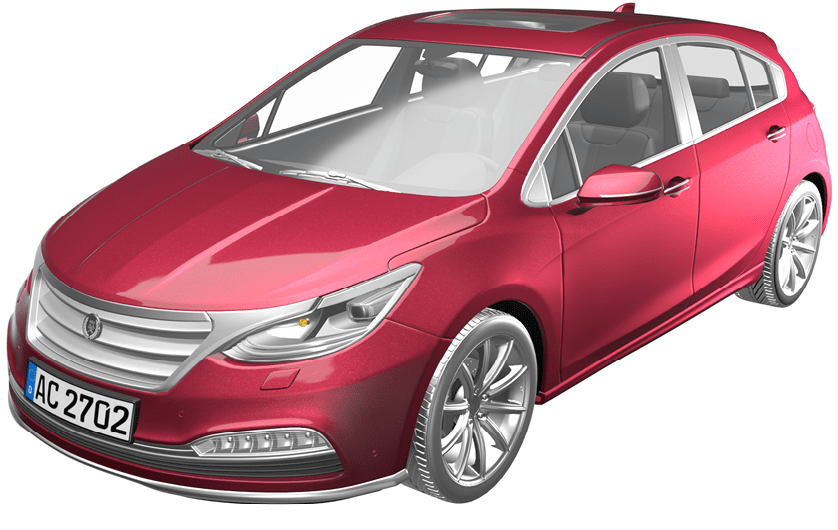
AC 2702
Dahlia
MICROSCOPIC
PHOTOGRAPHY

COLOR
CHANGE
100
100
b
a
-100
50
-50
50
-50
-100

REFLECTANCE CURVES


Reflection [%] vs.
wavelength [nm]
15 °
- 15 °
25 °
45 °
75 °
110 °


RECIPE
|
40.00% |
|
|
10.00% |
|
|
5.00% |
|
|
25.00% |
|
|
20.00% |
PIGMENTATION LEVEL
|
Pigment in wet paint |
4.7% |
|
Pigment to binder ratio |
23.0% |
NIR Reflectance
|
900 nm |
66.8% |
|
1550 nm |
71.9% |
|
Flop Index |
13.8 |
|
L [-15°] |
79.4 |
AC 2702

AC 2702
Dahlia
MICROSCOPIC
PHOTOGRAPHY

RECIPE
|
40.00% |
|
|
10.00% |
|
|
5.00% |
|
|
25.00% |
|
|
20.00% |
PIGMENTATION LEVEL
|
Pigment in wet paint |
4.7% |
|
Pigment to binder ratio |
23.0% |
NIR Reflectance
|
900 nm |
66.8% |
|
1550 nm |
71.9% |
|
Flop Index |
13.8 |
|
L [-15°] |
79.4 |
REFLECTANCE CURVES


Reflection [%] vs.
wavelength [nm]
15 °
- 15 °
25 °
45 °
75 °
110 °

COLOR CHANGE
100
100
b
a
-100
50
-50
50
-50
-100

AC 2702

AC 2702
Dahlia
RECIPE
|
40.00% |
|
|
10.00% |
|
|
5.00% |
|
|
25.00% |
|
|
20.00% |
PIGMENTATION LEVEL
|
Pigment in wet paint |
4.7% |
|
Pigment to binder ratio |
23.0% |
NIR Reflectance
|
900 nm |
66.8% |
|
1550 nm |
71.9% |
|
Flop Index |
13.8 |
|
L [-15°] |
79.4 |
COLOR
CHANGE


REFLECTANCE CURVES


Reflection [%] vs.
wavelength [nm]
MICROSCOPIC
PHOTOGRAPHY

AC 2703
REFLECTANCE CURVES

Reflection [%] vs.
wavelength [nm]
45 °


AC 2703
Dandelion
MICROSCOPIC
PHOTOGRAPHY
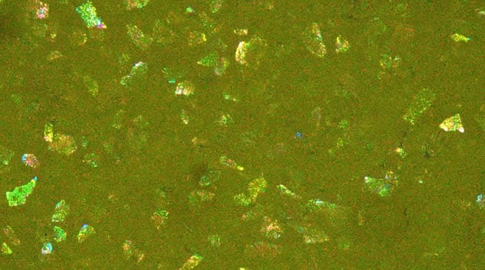
COLOR
CHANGE
100
100
b
a
-100
50
-50
50
-50
-100

RECIPE
|
5.40% |
|
|
1.80% |
|
|
52.80% |
|
|
40.00% |
PIGMENTATION LEVEL
|
Pigment in wet paint |
19.4% |
|
Pigment to binder ratio |
106.6% |
NIR Reflectance
|
900 nm |
82.9% |
|
1550 nm |
79.6% |
|
Flop Index |
0.2 |
|
L [-15°] |
81.5 |
AC 2703

AC 2703
Dandelion
MICROSCOPIC
PHOTOGRAPHY

RECIPE
|
5.40% |
|
|
1.80% |
|
|
52.80% |
|
|
40.00% |
PIGMENTATION LEVEL
|
Pigment in wet paint |
19.4% |
|
Pigment to binder ratio |
106.6% |
NIR Reflectance
|
900 nm |
82.9% |
|
1550 nm |
79.6% |
|
Flop Index |
0.2 |
|
L [-15°] |
81.5 |
REFLECTANCE CURVES

Reflection [%] vs.
wavelength [nm]
45 °


COLOR CHANGE
100
100
b
a
-100
50
-50
50
-50
-100

AC 2703

AC 2703
Dandelion
RECIPE
|
5.40% |
|
|
1.80% |
|
|
52.80% |
|
|
40.00% |
PIGMENTATION LEVEL
|
Pigment in wet paint |
19.4% |
|
Pigment to binder ratio |
106.6% |
NIR Reflectance
|
900 nm |
82.9% |
|
1550 nm |
79.6% |
|
Flop Index |
0.2 |
|
L [-15°] |
81.5 |
COLOR
CHANGE


REFLECTANCE CURVES


Reflection [%] vs.
wavelength [nm]
MICROSCOPIC
PHOTOGRAPHY

AC 2704

AC 2704
High
Noon
MICROSCOPIC
PHOTOGRAPHY

COLOR
CHANGE
100
100
b
a
-100
50
-50
50
-50
-100

RECIPE
|
10.00% |
|
|
20.00% |
|
|
20.00% |
|
|
20.00% |
|
|
STAPA® IL HYDROLAN® 2156 55900/G > |
20.00% |
|
10.00% |
REFLECTANCE CURVES


Reflection [%] vs.
wavelength [nm]
15 °
- 15 °
25 °
45 °
75 °
110 °
PIGMENTATION LEVEL
|
Pigment in wet paint |
4.7% |
|
Pigment to binder ratio |
23.0% |
NIR Reflectance
|
900 nm |
74.9% |
|
1550 nm |
84.9% |
|
Flop Index |
22.0 |
|
L [-15°] |
89.9 |
AC 2704

AC 2704
High
Noon
MICROSCOPIC
PHOTOGRAPHY
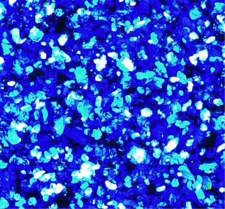
RECIPE
|
10.00% |
|
|
20.00% |
|
|
20.00% |
|
|
20.00% |
|
|
STAPA® IL HYDROLAN® 2156 55900/G > |
20.00% |
|
10.00% |
PIGMENTATION LEVEL
|
Pigment in wet paint |
4.7% |
|
Pigment to binder ratio |
23.0% |
NIR Reflectance
|
900 nm |
74.9% |
|
1550 nm |
84.9% |
|
Flop Index |
22.0 |
|
L [-15°] |
89.9 |
REFLECTANCE CURVES


Reflection [%] vs.
wavelength [nm]
15 °
- 15 °
25 °
45 °
75 °
110 °
COLOR CHANGE
100
100
b
a
-100
50
-50
50
-50
-100

AC 2704

AC 2704
High
Noon
RECIPE
|
10.00% |
|
|
20.00% |
|
|
20.00% |
|
|
20.00% |
|
|
STAPA® IL HYDROLAN® 2156 55900/G > |
20.00% |
|
10.00% |
PIGMENTATION LEVEL
|
Pigment in wet paint |
4.7% |
|
Pigment to binder ratio |
23.0% |
NIR Reflectance
|
900 nm |
74.9% |
|
1550 nm |
84.9% |
|
Flop Index |
22.0 |
|
L [-15°] |
89.9 |
COLOR
CHANGE


REFLECTANCE CURVES


15 °
- 15 °
25 °
45 °
75 °
110 °


Reflection [%] vs.
wavelength [nm]
MICROSCOPIC
PHOTOGRAPHY

PERFECTLY UMBRELLAED
TREND COLORS 2027 – Technical Details
Perfectly Umbrellaed

Personal safety is a key concern for most drivers, and this is reflected in these carefully selected colors. They are not overly bright and have timeless effects, providing an aura of stability and helping cars to hold their value regardless of transient fashions.
PERFECTLY UMBRELLAED
TREND COLORS 2027
Technical Details
Perfectly Umbrellaed
Personal safety is a key concern for most drivers, and this is reflected in these carefully selected colors. They are not overly bright and have timeless effects, providing an aura of stability and helping cars to hold their value regardless of transient fashions.
PERFECTLY UMBRELLAED


Personal safety is a key concern for most drivers, and this is reflected in these carefully selected colors. They are not overly bright and have timeless effects, providing an aura of stability and helping cars to hold their value regardless of transient fashions.
TREND
COLORS 2027
Technical
Details
Perfectly
Umbrellaed
AC 2705 Perennial
Gray
AC 2706 Ocean’s
One
AC 2712 Violet Witch
AC 2709 Silver Spurs
AC 2707 Noble Lilly
AC 2710 Smoky Mirror
AC 2708 Olivia
AC 2711 Viridescent Forest
AC 2705

MICROSCOPIC
PHOTOGRAPHY

AC 2705
Perennial
Gray
COLOR
CHANGE
100
100
b
a
-100
50
-50
50
-50
-100

RECIPE
|
17.50% |
|
|
22.00% |
|
|
10.50% |
|
|
50.00% |
REFLECTANCE CURVES


Reflection [%] vs.
wavelength [nm]
15 °
- 15 °
25 °
45 °
75 °
110 °


PIGMENTATION LEVEL
|
Pigment in wet paint |
2.2% |
|
Pigment to binder ratio |
10.7% |
NIR Reflectance
|
900 nm |
60.0% |
|
1550 nm |
64.1% |
|
Flop Index |
19.8 |
|
L [-15°] |
47.7 |
AC 2705

AC 2705
Perennial
Gray
MICROSCOPIC
PHOTOGRAPHY

RECIPE
|
17.50% |
|
|
22.00% |
|
|
10.50% |
|
|
50.00% |
PIGMENTATION LEVEL
|
Pigment in wet paint |
2.2% |
|
Pigment to binder ratio |
10.7% |
NIR Reflectance
|
900 nm |
60.0% |
|
1550 nm |
64.1% |
|
Flop Index |
19.8 |
|
L [-15°] |
47.7 |
REFLECTANCE CURVES
Reflection [%] vs.
wavelength [nm]
15 °
- 15 °
25 °
45 °
75 °
110 °

COLOR CHANGE
100
100
b
a
-100
50
-50
50
-50
-100

AC 2705

AC 2705
Perennial
Gray
RECIPE
|
17.50% |
|
|
22.00% |
|
|
10.50% |
|
|
50.00% |
PIGMENTATION LEVEL
|
Pigment in wet paint |
2.2% |
|
Pigment to binder ratio |
10.7% |
NIR Reflectance
|
900 nm |
60.0% |
|
1550 nm |
64.1% |
|
Flop Index |
19.8 |
|
L [-15°] |
47.7 |
COLOR
CHANGE

REFLECTANCE CURVES


Reflection [%] vs.
wavelength [nm]
MICROSCOPIC
PHOTOGRAPHY

AC 2706

MICROSCOPIC
PHOTOGRAPHY

AC 2706
Ocean’s
One
COLOR
CHANGE
100
100
b
a
-100
50
-50
50
-50
-100

RECIPE
|
13.00% |
|
|
20.00% |
|
|
17.00% |
|
|
20.00% |
|
|
STAPA® IL HYDROLAN® 2156 55900/G > |
20.00% |
|
10.00% |
REFLECTANCE CURVES


Reflection [%] vs.
wavelength [nm]
15 °
- 15 °
25 °
45 °
75 °
110 °

PIGMENTATION LEVEL
|
Pigment in wet paint |
2.1% |
|
Pigment to binder ratio |
10.1% |
NIR Reflectance
|
900 nm |
73.4% |
|
1550 nm |
83.3% |
|
Flop Index |
21.7 |
|
L [-15°] |
87.5 |
AC 2706

AC 2706
Ocean’s
One
RECIPE
|
13.00% |
|
|
20.00% |
|
|
17.00% |
|
|
20.00% |
|
|
STAPA® IL HYDROLAN® 2156 55900/G > |
20.00% |
|
10.00% |
PIGMENTATION LEVEL
|
Pigment in wet paint |
2.1% |
|
Pigment to binder ratio |
10.1% |
NIR Reflectance
|
900 nm |
73.4% |
|
1550 nm |
83.3% |
|
Flop Index |
21.7 |
|
L [-15°] |
87.5 |

MICROSCOPIC
PHOTOGRAPHY
100
100
b
a
-100
50
-50
50
-50
-100

COLOR CHANGE


Reflection [%] vs.
wavelength [nm]
15 °
- 15 °
25 °
45 °
75 °
110 °
REFLECTANCE CURVES
AC 2706

AC 2706
Ocean’s
One
RECIPE
|
13.00% |
|
|
20.00% |
|
|
17.00% |
|
|
20.00% |
|
|
STAPA® IL HYDROLAN® 2156 55900/G > |
20.00% |
|
10.00% |
PIGMENTATION LEVEL
|
Pigment in wet paint |
2.1% |
|
Pigment to binder ratio |
10.1% |
NIR Reflectance
|
900 nm |
73.4% |
|
1550 nm |
83.3% |
|
Flop Index |
21.7 |
|
L [-15°] |
87.5 |
COLOR
CHANGE

MICROSCOPIC
PHOTOGRAPHY

REFLECTANCE CURVES


Reflection [%] vs.
wavelength [nm]
AC 2707

AC 2707
Noble
Lilly
RECIPE
|
2.00% |
|
|
1.00% |
|
|
5.00% |
|
|
45.00% |
|
|
47.00% |
PIGMENTATION LEVEL
|
Pigment in wet paint |
10.6% |
|
Pigment to binder ratio |
53.7% |
NIR Reflectance
|
900 nm |
62.8% |
|
1550 nm |
68.1% |
|
Flop Index |
12.2 |
|
L [-15°] |
88.4 |


Reflection [%] vs.
wavelength [nm]
15 °
- 15 °
25 °
45 °
75 °
110 °

REFLECTANCE CURVES
100
100
b
a
-100
50
-50
50
-50
-100

COLOR
CHANGE

MICROSCOPIC
PHOTOGRAPHY
AC 2707

AC 2707
Noble
Lilly
MICROSCOPIC
PHOTOGRAPHY

RECIPE
|
2.00% |
|
|
1.00% |
|
|
5.00% |
|
|
45.00% |
|
|
47.00% |
PIGMENTATION LEVEL
|
Pigment in wet paint |
10.6% |
|
Pigment to binder ratio |
53.7% |
NIR Reflectance
|
900 nm |
62.8% |
|
1550 nm |
68.1% |
|
Flop Index |
12.2 |
|
L [-15°] |
88.4 |
REFLECTANCE CURVES


Reflection [%] vs.
wavelength [nm]
15 °
- 15 °
25 °
45 °
75 °
110 °
COLOR CHANGE
100
100
b
a
-100
50
-50
50
-50
-100

AC 2707

AC 2707
Noble
Lilly
RECIPE
|
2.00% |
|
|
1.00% |
|
|
5.00% |
|
|
45.00% |
|
|
47.00% |
PIGMENTATION LEVEL
|
Pigment in wet paint |
10.6% |
|
Pigment to binder ratio |
53.7% |
NIR Reflectance
|
900 nm |
62.8% |
|
1550 nm |
68.1% |
|
Flop Index |
12.2 |
|
L [-15°] |
88.4 |
COLOR
CHANGE

MICROSCOPIC
PHOTOGRAPHY

REFLECTANCE CURVES


Reflection [%] vs.
wavelength [nm]
AC 2708

MICROSCOPIC
PHOTOGRAPHY

AC 2708
Olivia
COLOR
CHANGE
100
100
b
a
-100
50
-50
50
-50
-100

RECIPE
|
8.00% |
|
|
1.00% |
|
|
1.00% |
|
|
27.00% |
|
|
63.00% |
REFLECTANCE CURVES


Reflection [%] vs.
wavelength [nm]
15 °
- 15 °
25 °
45 °
75 °
110 °
* Monastral™ pigments are not available in the USA
PIGMENTATION LEVEL
|
Pigment in wet paint |
13.5% |
|
Pigment to binder ratio |
68.3% |
NIR Reflectance
|
900 nm |
50.8% |
|
1550 nm |
62.9% |
|
Flop Index |
9.6 |
|
L [-15°] |
84.6 |
AC 2708

AC 2708
Olivia
RECIPE
|
8.00% |
|
|
1.00% |
|
|
1.00% |
|
|
27.00% |
|
|
63.00% |
PIGMENTATION LEVEL
|
Pigment in wet paint |
13.5% |
|
Pigment to binder ratio |
68.3% |
NIR Reflectance
|
900 nm |
50.8% |
|
1550 nm |
62.9% |
|
Flop Index |
9.6 |
|
L [-15°] |
84.6 |

MICROSCOPIC
PHOTOGRAPHY
100
100
b
a
-100
50
-50
50
-50
-100

COLOR CHANGE
* Monastral™ pigments are not available in the USA


Reflection [%] vs.
wavelength [nm]
15 °
- 15 °
25 °
45 °
75 °
110 °
REFLECTANCE CURVES
AC 2708

AC 2708
Olivia
RECIPE
|
8.00% |
|
|
1.00% |
|
|
1.00% |
|
|
27.00% |
|
|
63.00% |
PIGMENTATION LEVEL
|
Pigment in wet paint |
13.5% |
|
Pigment to binder ratio |
68.3% |
NIR Reflectance
|
900 nm |
50.8% |
|
1550 nm |
62.9% |
|
Flop Index |
9.6 |
|
L [-15°] |
84.6 |
COLOR
CHANGE

MICROSCOPIC
PHOTOGRAPHY

REFLECTANCE CURVES
* Monastral™ pigments are not available in the USA


Reflection [%] vs.
wavelength [nm]
AC 2709

MICROSCOPIC
PHOTOGRAPHY

AC 2709
Silver
Spurs
COLOR
CHANGE
100
100
b
a
-100
50
-50
50
-50
-100

RECIPE
|
1.00% |
|
|
4.00% |
|
|
95.00% |
REFLECTANCE CURVES


Reflection [%] vs.
wavelength [nm]
15 °
- 15 °
25 °
45 °
75 °
110 °
PIGMENTATION LEVEL
|
Pigment in wet paint |
4.0% |
|
Pigment to binder ratio |
23.0% |
NIR Reflectance
|
900 nm |
67.9% |
|
1550 nm |
78.4% |
|
Flop Index |
11.5 |
|
L [-15°] |
130.7 |
AC 2709

AC 2709
Silver
Spurs
MICROSCOPIC
PHOTOGRAPHY

RECIPE
|
1.00% |
|
|
4.00% |
|
|
95.00% |
PIGMENTATION LEVEL
|
Pigment in wet paint |
4.0% |
|
Pigment to binder ratio |
23.0% |
NIR Reflectance
|
900 nm |
67.9% |
|
1550 nm |
78.4% |
|
Flop Index |
11.5 |
|
L [-15°] |
130.7 |
REFLECTANCE CURVES

Reflection [%] vs.
wavelength [nm]
15 °
- 15 °
25 °
45 °
75 °
110 °
COLOR CHANGE
100
100
b
a
-100
50
-50
50
-50
-100

AC 2709

AC 2709
Silver
Spurs
RECIPE
|
1.00% |
|
|
4.00% |
|
|
95.00% |
PIGMENTATION LEVEL
|
Pigment in wet paint |
4.0% |
|
Pigment to binder ratio |
23.0% |
NIR Reflectance
|
900 nm |
67.9% |
|
1550 nm |
78.4% |
|
Flop Index |
11.5 |
|
L [-15°] |
130.7 |
COLOR
CHANGE


MICROSCOPIC
PHOTOGRAPHY

REFLECTANCE CURVES


Reflection [%] vs.
wavelength [nm]
AC 2710

MICROSCOPIC
PHOTOGRAPHY

AC 2710
Smoky
Mirror
COLOR
CHANGE
100
100
b
a
-100
50
-50
50
-50
-100

RECIPE
|
5.00% |
|
|
15.00% |
|
|
60.00% |
|
|
20.00% |
REFLECTANCE CURVES


Reflection [%] vs.
wavelength [nm]
15 °
- 15 °
25 °
45 °
75 °
110 °


PIGMENTATION LEVEL
|
Pigment in wet paint |
1.2% |
|
Pigment to binder ratio |
6.1% |
NIR Reflectance
|
900 nm |
74.3% |
|
1550 nm |
82.4% |
|
Flop Index |
22.1 |
|
L [-15°] |
162.9 |
AC 2710

AC 2710
Smoky
Mirror
MICROSCOPIC
PHOTOGRAPHY

RECIPE
|
5.00% |
|
|
15.00% |
|
|
60.00% |
|
|
20.00% |
PIGMENTATION LEVEL
|
Pigment in wet paint |
1.2% |
|
Pigment to binder ratio |
6.1% |
NIR Reflectance
|
900 nm |
74.3% |
|
1550 nm |
82.4% |
|
Flop Index |
22.1 |
|
L [-15°] |
162.9 |
REFLECTANCE CURVES


Reflection [%] vs.
wavelength [nm]
15 °
- 15 °
25 °
45 °
75 °
110 °

COLOR CHANGE
100
100
b
a
-100
50
-50
50
-50
-100

AC 2710
MICROSCOPIC
PHOTOGRAPHY


AC 2710
Smoky
Mirror
RECIPE
|
5.00% |
|
|
15.00% |
|
|
60.00% |
|
|
20.00% |
PIGMENTATION LEVEL
|
Pigment in wet paint |
1.2% |
|
Pigment to binder ratio |
6.1% |
NIR Reflectance
|
900 nm |
74.3% |
|
1550 nm |
82.4% |
|
Flop Index |
22.1 |
|
L [-15°] |
162.9 |
COLOR
CHANGE

REFLECTANCE CURVES


Reflection [%] vs.
wavelength [nm]
AC 2711

MICROSCOPIC
PHOTOGRAPHY

AC 2711
Viridescent
Forest
COLOR
CHANGE
100
100
b
a
-100
50
-50
50
-50
-100

RECIPE
|
5.00% |
|
|
20.00% |
|
|
10.00% |
|
|
60.00% |
|
|
5.00% |
REFLECTANCE CURVES


Reflection [%] vs.
wavelength [nm]
15 °
- 15 °
25 °
45 °
75 °
110 °
PIGMENTATION LEVEL
|
Pigment in wet paint |
7.8% |
|
Pigment to binder ratio |
37.5% |
NIR Reflectance
|
900 nm |
61.5% |
|
1550 nm |
78.9% |
|
Flop Index |
29.2 |
|
L [-15°] |
54.0 |
AC 2711

AC 2711
Viridescent
Forest
MICROSCOPIC
PHOTOGRAPHY

RECIPE
|
5.00% |
|
|
20.00% |
|
|
10.00% |
|
|
60.00% |
|
|
5.00% |
PIGMENTATION LEVEL
|
Pigment in wet paint |
7.8% |
|
Pigment to binder ratio |
37.5% |
NIR Reflectance
|
900 nm |
61.5% |
|
1550 nm |
78.9% |
|
Flop Index |
29.2 |
|
L [-15°] |
54.0 |
COLOR CHANGE
100
100
b
a
-100
50
-50
50
-50
-100

REFLECTANCE CURVES


Reflection [%] vs.
wavelength [nm]
15 °
- 15 °
25 °
45 °
75 °
110 °
AC 2711

AC 2711
Viridescent
Forest
RECIPE
|
5.00% |
|
|
20.00% |
|
|
10.00% |
|
|
60.00% |
|
|
5.00% |
PIGMENTATION LEVEL
|
Pigment in wet paint |
7.8% |
|
Pigment to binder ratio |
37.5% |
NIR Reflectance
|
900 nm |
61.5% |
|
1550 nm |
78.9% |
|
Flop Index |
29.2 |
|
L [-15°] |
54.0 |
MICROSCOPIC
PHOTOGRAPHY

COLOR
CHANGE


REFLECTANCE CURVES


Reflection [%] vs.
wavelength [nm]
AC 2712

MICROSCOPIC
PHOTOGRAPHY

AC 2712
Violet
Witch
COLOR
CHANGE
100
100
b
a
-100
50
-50
50
-50
-100

RECIPE
|
30.00% |
|
|
10.00% |
|
|
45.00% |
|
|
15.00% |
REFLECTANCE CURVES


Reflection [%] vs.
wavelength [nm]
15 °
- 15 °
25 °
45 °
75 °
110 °
PIGMENTATION LEVEL
|
Pigment in wet paint |
7.7% |
|
Pigment to binder ratio |
37.6% |
NIR Reflectance
|
900 nm |
59.4% |
|
1550 nm |
80.4% |
|
Flop Index |
22.9 |
|
L [-15°] |
35.1 |
AC 2712

AC 2712
Violet
Witch
MICROSCOPIC
PHOTOGRAPHY

RECIPE
|
30.00% |
|
|
10.00% |
|
|
45.00% |
|
|
15.00% |
PIGMENTATION LEVEL
|
Pigment in wet paint |
7.7% |
|
Pigment to binder ratio |
37.6% |
NIR Reflectance
|
900 nm |
59.4% |
|
1550 nm |
80.4% |
|
Flop Index |
22.9 |
|
L [-15°] |
35.1 |
COLOR CHANGE
100
100
b
a
-100
50
-50
50
-50
-100

REFLECTANCE CURVES


Reflection [%] vs.
wavelength [nm]
15 °
- 15 °
25 °
45 °
75 °
110 °

AC 2712

AC 2712
Violet
Witch
MICROSCOPIC
PHOTOGRAPHY

RECIPE
|
30.00% |
|
|
10.00% |
|
|
45.00% |
|
|
15.00% |
PIGMENTATION LEVEL
|
Pigment in wet paint |
7.7% |
|
Pigment to binder ratio |
37.6% |
NIR Reflectance
|
900 nm |
59.4% |
|
1550 nm |
80.4% |
|
Flop Index |
22.9 |
|
L [-15°] |
35.1 |
COLOR
CHANGE

REFLECTANCE CURVES
Reflection [%] vs.
wavelength [nm]


UNCONDITIONAL FAIRNESS
TREND COLORS 2027 – Technical Details
Unconditional Fairness

Altruism is a key virtue for people selecting these colors for their vehicles. Fair trade, sustainable food production and equal pay play a major role in their daily decisions. The colors show a high degree of clarity and brilliance, supporting the optimism associated with commitments to personal and global fairness.
UNCONDITIONAL FAIRNESS
TREND COLORS 2027
Technical Details
Unconditional Fairness

Altruism is a key virtue for people selecting these colors for their vehicles. Fair trade, sustainable food production and equal pay play a major role in their daily decisions. The colors show a high degree of clarity and brilliance, supporting the optimism associated with commitments to personal and global fairness.
UNCONDITIONAL FAIRNESS
TREND
COLORS 2027
Technical
Details
Unconditional
Fairness


Altruism is a key virtue for people selecting these colors for their vehicles. Fair trade, sustainable food production and equal pay play a major role in their daily decisions. The colors show a high degree of clarity and brilliance, supporting the optimism associated with commitments to personal and global fairness.
AC 2719 Marigold
AC 2713 Red Horizon
AC 2720 Magnolia
AC 2716
Fresh
Foliage
AC 2714 Infiniteal
AC 2717 Copper-
head
AC 2715 Sea Jewel
AC 2718 Molten Gold
AC 2713

MICROSCOPIC
PHOTOGRAPHY

AC 2713
Red
Horizon
COLOR
CHANGE
100
100
b
a
-100
50
-50
50
-50
-100

RECIPE
|
4.00% |
|
|
6.00% |
|
|
60.00% |
|
|
30.00% |
REFLECTANCE CURVES


Reflection [%] vs.
wavelength [nm]
15 °
- 15 °
25 °
45 °
75 °
110 °


PIGMENTATION LEVEL
|
Pigment in wet paint |
11.4% |
|
Pigment to binder ratio |
56.7% |
NIR Reflectance
|
900 nm |
48.7% |
|
1550 nm |
86.7% |
|
Flop Index |
11.6 |
|
L [-15°] |
70.9 |
AC 2713

AC 2713
Red
Horizon
RECIPE
|
4.00% |
|
|
6.00% |
|
|
60.00% |
|
|
30.00% |
PIGMENTATION LEVEL
|
Pigment in wet paint |
11.4% |
|
Pigment to binder ratio |
56.7% |
NIR Reflectance
|
900 nm |
48.7% |
|
1550 nm |
86.7% |
|
Flop Index |
11.6 |
|
L [-15°] |
70.9 |

MICROSCOPIC
PHOTOGRAPHY
100
100
b
a
-100
50
-50
50
-50
-100

COLOR CHANGE


Reflection [%] vs.
wavelength [nm]
15 °
- 15 °
25 °
45 °
75 °
110 °
REFLECTANCE CURVES
AC 2713

AC 2713
Red
Horizon
RECIPE
|
4.00% |
|
|
6.00% |
|
|
60.00% |
|
|
30.00% |
PIGMENTATION LEVEL
|
Pigment in wet paint |
11.4% |
|
Pigment to binder ratio |
56.7% |
NIR Reflectance
|
900 nm |
48.7% |
|
1550 nm |
86.7% |
|
Flop Index |
11.6 |
|
L [-15°] |
70.9 |
COLOR
CHANGE

MICROSCOPIC
PHOTOGRAPHY

REFLECTANCE CURVES


Reflection [%] vs.
wavelength [nm]
AC 2714

MICROSCOPIC
PHOTOGRAPHY

AC 2714
Infiniteal
COLOR
CHANGE
100
100
b
a
-100
50
-50
50
-50
-100

RECIPE
|
4.00% |
|
|
25.00% |
|
|
20.00% |
|
|
1.00% |
|
|
20.00% |
|
|
STAPA® IL HYDROLAN® 2156 55900/G > |
20.00% |
|
10.00% |
REFLECTANCE CURVES


Reflection [%] vs.
wavelength [nm]
15 °
- 15 °
25 °
45 °
75 °
110 °

PIGMENTATION LEVEL
|
Pigment in wet paint |
3.7% |
|
Pigment to binder ratio |
18.1% |
NIR Reflectance
|
900 nm |
77.0% |
|
1550 nm |
85.6% |
|
Flop Index |
22.4 |
|
L [-15°] |
121.1 |
AC 2714

AC 2714
Infiniteal
MICROSCOPIC
PHOTOGRAPHY

RECIPE
|
4.00% |
|
|
25.00% |
|
|
20.00% |
|
|
1.00% |
|
|
20.00% |
|
|
STAPA® IL HYDROLAN® 2156 55900/G > |
20.00% |
|
10.00% |
PIGMENTATION LEVEL
|
Pigment in wet paint |
3.7% |
|
Pigment to binder ratio |
18.1% |
NIR Reflectance
|
900 nm |
77.0% |
|
1550 nm |
85.6% |
|
Flop Index |
22.4 |
|
L [-15°] |
121.1 |
COLOR CHANGE
100
100
b
a
-100
50
-50
50
-50
-100

REFLECTANCE CURVES


Reflection [%] vs.
wavelength [nm]
15 °
- 15 °
25 °
45 °
75 °
110 °
AC 2714

AC 2714
Infiniteal
RECIPE
|
4.00% |
|
|
25.00% |
|
|
20.00% |
|
|
1.00% |
|
|
20.00% |
|
|
STAPA® IL HYDROLAN® 2156 55900/G > |
20.00% |
|
10.00% |
PIGMENTATION LEVEL
|
Pigment in wet paint |
3.7% |
|
Pigment to binder ratio |
18.1% |
NIR Reflectance
|
900 nm |
77.0% |
|
1550 nm |
85.6% |
|
Flop Index |
22.4 |
|
L [-15°] |
121.1 |
COLOR
CHANGE


MICROSCOPIC
PHOTOGRAPHY

REFLECTANCE CURVES


Reflection [%] vs.
wavelength [nm]
AC 2715

MICROSCOPIC
PHOTOGRAPHY

AC 2715
Sea
Jewel
COLOR
CHANGE
100
100
b
a
-100
50
-50
50
-50
-100

RECIPE
|
25.00% |
|
|
25.00% |
|
|
22.00% |
|
|
6.00% |
|
|
22.00% |
REFLECTANCE CURVES


Reflection [%] vs.
wavelength [nm]
15 °
- 15 °
25 °
45 °
75 °
110 °
PIGMENTATION LEVEL
|
Pigment in wet paint |
6.7% |
|
Pigment to binder ratio |
32.0% |
NIR Reflectance
|
900 nm |
54.9% |
|
1550 nm |
75.4% |
|
Flop Index |
29.0 |
|
L [-15°] |
70.2 |
AC 2715

AC 2715
Sea
Jewel
MICROSCOPIC
PHOTOGRAPHY

RECIPE
|
25.00% |
|
|
25.00% |
|
|
22.00% |
|
|
6.00% |
|
|
22.00% |
PIGMENTATION LEVEL
|
Pigment in wet paint |
6.7% |
|
Pigment to binder ratio |
32.0% |
NIR Reflectance
|
900 nm |
54.9% |
|
1550 nm |
75.4% |
|
Flop Index |
29.0 |
|
L [-15°] |
70.2 |
COLOR CHANGE


100
100
b
a
-100
50
-50
50
-50
-100

REFLECTANCE CURVES


Reflection [%] vs.
wavelength [nm]
15 °
- 15 °
25 °
45 °
75 °
110 °
AC 2715

AC 2715
Sea
Jewel
RECIPE
|
25.00% |
|
|
25.00% |
|
|
22.00% |
|
|
6.00% |
|
|
22.00% |
PIGMENTATION LEVEL
|
Pigment in wet paint |
6.7% |
|
Pigment to binder ratio |
32.0% |
NIR Reflectance
|
900 nm |
54.9% |
|
1550 nm |
75.4% |
|
Flop Index |
29.0 |
|
L [-15°] |
70.2 |
COLOR
CHANGE


MICROSCOPIC
PHOTOGRAPHY

REFLECTANCE CURVES


Reflection [%] vs.
wavelength [nm]
AC 2716
REFLECTANCE CURVES

MICROSCOPIC
PHOTOGRAPHY

AC 2716
Fresh
Foliage
COLOR
CHANGE
100
100
b
a
-100
50
-50
50
-50
-100

RECIPE
|
10.00% |
|
|
5.00% |
|
|
35.00% |
|
|
25.00% |
|
|
25.00% |


Reflection [%] vs.
wavelength [nm]
15 °
- 15 °
25 °
45 °
75 °
110 °
* Monastral™ pigments are not available in the USA
PIGMENTATION LEVEL
|
Pigment in wet paint |
3.4% |
|
Pigment to binder ratio |
17.0% |
NIR Reflectance
|
900 nm |
63.8% |
|
1550 nm |
75.2% |
|
Flop Index |
19.3 |
|
L [-15°] |
118.8 |
AC 2716

AC 2716
Fresh
Foliage
MICROSCOPIC
PHOTOGRAPHY

RECIPE
|
10.00% |
|
|
5.00% |
|
|
35.00% |
|
|
25.00% |
|
|
25.00% |
PIGMENTATION LEVEL
|
Pigment in wet paint |
3.4% |
|
Pigment to binder ratio |
17.0% |
NIR Reflectance
|
900 nm |
63.8% |
|
1550 nm |
75.2% |
|
Flop Index |
19.3 |
|
L [-15°] |
118.8 |
COLOR CHANGE
100
100
b
a
-100
50
-50
50
-50
-100

REFLECTANCE CURVES
* Monastral™ pigments are not available in the USA


Reflection [%] vs.
wavelength [nm]
15 °
- 15 °
25 °
45 °
75 °
110 °
AC 2716

AC 2716
Fresh
Foliage
RECIPE
|
10.00% |
|
|
5.00% |
|
|
35.00% |
|
|
25.00% |
|
|
25.00% |
PIGMENTATION LEVEL
|
Pigment in wet paint |
3.4% |
|
Pigment to binder ratio |
17.0% |
NIR Reflectance
|
900 nm |
63.8% |
|
1550 nm |
75.2% |
|
Flop Index |
19.3 |
|
L [-15°] |
118.8 |

COLOR
CHANGE

MICROSCOPIC
PHOTOGRAPHY


Reflection [%] vs.
wavelength [nm]
REFLECTANCE CURVES
AC 2717

MICROSCOPIC
PHOTOGRAPHY

AC 2717
Copperhead
COLOR
CHANGE
100
100
b
a
-100
50
-50
50
-50
-100

RECIPE
|
2.00% |
|
|
8.00% |
|
|
45.00% |
|
|
45.00% |
REFLECTANCE CURVES


Reflection [%] vs.
wavelength [nm]
15 °
- 15 °
25 °
45 °
75 °
110 °
PIGMENTATION LEVEL
|
Pigment in wet paint |
11.9% |
|
Pigment to binder ratio |
59.2% |
NIR Reflectance
|
900 nm |
71.9% |
|
1550 nm |
84.2% |
|
Flop Index |
16.3 |
|
L [-15°] |
98.4 |
AC 2717

AC 2717
Copperhead
MICROSCOPIC
PHOTOGRAPHY

RECIPE
|
2.00% |
|
|
8.00% |
|
|
45.00% |
|
|
45.00% |
PIGMENTATION LEVEL
|
Pigment in wet paint |
11.9% |
|
Pigment to binder ratio |
59.2% |
NIR Reflectance
|
900 nm |
71.9% |
|
1550 nm |
84.2% |
|
Flop Index |
16.3 |
|
L [-15°] |
98.4 |
COLOR CHANGE
100
100
b
a
-100
50
-50
50
-50
-100

REFLECTANCE CURVES

Reflection [%] vs.
wavelength [nm]
15 °
- 15 °
25 °
45 °
75 °
110 °
AC 2717

AC 2717
Copperhead
RECIPE
|
2.00% |
|
|
8.00% |
|
|
45.00% |
|
|
45.00% |
PIGMENTATION LEVEL
|
Pigment in wet paint |
11.9% |
|
Pigment to binder ratio |
59.2% |
NIR Reflectance
|
900 nm |
71.9% |
|
1550 nm |
84.2% |
|
Flop Index |
16.3 |
|
L [-15°] |
98.4 |
COLOR
CHANGE

MICROSCOPIC
PHOTOGRAPHY

REFLECTANCE CURVES


Reflection [%] vs.
wavelength [nm]
AC 2718

MICROSCOPIC
PHOTOGRAPHY
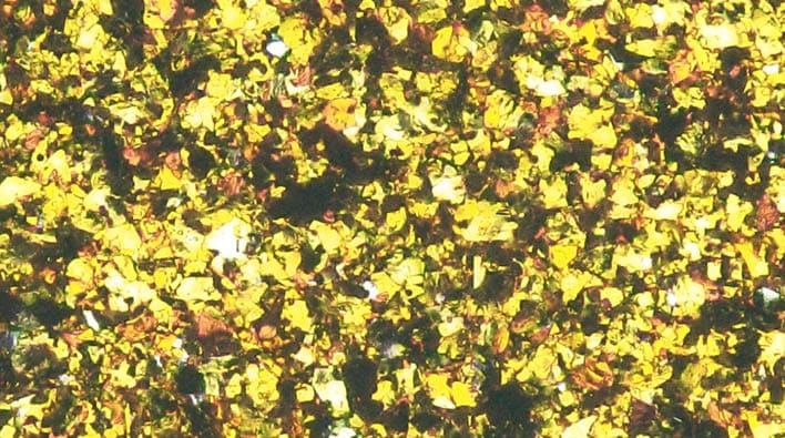
AC 2718
Molten
Gold
COLOR
CHANGE
100
100
b
a
-100
50
-50
50
-50
-100

REFLECTANCE CURVES


Reflection [%] vs.
wavelength [nm]
15 °
- 15 °
25 °
45 °
75 °
110 °
RECIPE
|
6.00% |
|
|
1.00% |
|
|
2.00% |
|
|
1.00% |
|
|
75.00% |
|
|
15.00% |
* Monastral™ pigments are not available in the USA
PIGMENTATION LEVEL
|
Pigment in wet paint |
6.5% |
|
Pigment to binder ratio |
32.6% |
NIR Reflectance
|
900 nm |
72.0% |
|
1550 nm |
74.4% |
|
Flop Index |
15.1 |
|
L [-15°] |
127.9 |
AC 2718

AC 2718
Molten
Gold
MICROSCOPIC
PHOTOGRAPHY

RECIPE
|
6.00% |
|
|
1.00% |
|
|
2.00% |
|
|
1.00% |
|
|
75.00% |
|
|
15.00% |
PIGMENTATION LEVEL
|
Pigment in wet paint |
6.5% |
|
Pigment to binder ratio |
32.6% |
NIR Reflectance
|
900 nm |
72.0% |
|
1550 nm |
74.4% |
|
Flop Index |
15.1 |
|
L [-15°] |
127.9 |
COLOR CHANGE
100
100
b
a
-100
50
-50
50
-50
-100

REFLECTANCE CURVES
* Monastral™ pigments are not available in the USA


Reflection [%] vs.
wavelength [nm]
15 °
- 15 °
25 °
45 °
75 °
110 °
AC 2718

AC 2718
Molten
Gold
RECIPE
|
6.00% |
|
|
1.00% |
|
|
2.00% |
|
|
1.00% |
|
|
75.00% |
|
|
15.00% |
PIGMENTATION LEVEL
|
Pigment in wet paint |
6.5% |
|
Pigment to binder ratio |
32.6% |
NIR Reflectance
|
900 nm |
72.0% |
|
1550 nm |
74.4% |
|
Flop Index |
15.1 |
|
L [-15°] |
127.9 |
COLOR
CHANGE


MICROSCOPIC
PHOTOGRAPHY

REFLECTANCE CURVES


Reflection [%] vs.
wavelength [nm]
AC 2719

MICROSCOPIC
PHOTOGRAPHY

AC 2719
Marigold
COLOR
CHANGE
100
100
b
a
-100
50
-50
50
-50
-100

RECIPE
|
6.00% |
|
|
1.00% |
|
|
3.00% |
|
|
90.00% |
REFLECTANCE CURVES


Reflection [%] vs.
wavelength [nm]
15 °
- 15 °
25 °
45 °
75 °
110 °
* Monastral™ pigments are not available in the USA
PIGMENTATION LEVEL
|
Pigment in wet paint |
5.9% |
|
Pigment to binder ratio |
29.5% |
NIR Reflectance
|
900 nm |
71.7% |
|
1550 nm |
74.6 % |
|
Flop Index |
14.6 |
|
L [-15°] |
129.0 |
AC 2719

AC 2719
Marigold
MICROSCOPIC
PHOTOGRAPHY

RECIPE
|
6.00% |
|
|
1.00% |
|
|
3.00% |
|
|
90.00% |
PIGMENTATION LEVEL
|
Pigment in wet paint |
5.9% |
|
Pigment to binder ratio |
29.5% |
NIR Reflectance
|
900 nm |
71.7% |
|
1550 nm |
74.6 % |
|
Flop Index |
14.6 |
|
L [-15°] |
129.0 |
COLOR CHANGE
100
100
b
a
-100
50
-50
50
-50
-100

REFLECTANCE CURVES
* Monastral™ pigments are not available in the USA


Reflection [%] vs.
wavelength [nm]
15 °
- 15 °
25 °
45 °
75 °
110 °
AC 2719

AC 2719
Marigold
RECIPE
|
6.00% |
|
|
1.00% |
|
|
3.00% |
|
|
90.00% |
PIGMENTATION LEVEL
|
Pigment in wet paint |
5.9% |
|
Pigment to binder ratio |
29.5% |
NIR Reflectance
|
900 nm |
71.7% |
|
1550 nm |
74.6 % |
|
Flop Index |
14.6 |
|
L [-15°] |
129.0 |
COLOR
CHANGE

MICROSCOPIC
PHOTOGRAPHY

REFLECTANCE CURVES


Reflection [%] vs.
wavelength [nm]
AC 2720

MICROSCOPIC
PHOTOGRAPHY

AC 2720
MAGNOLIA
COLOR
CHANGE
100
100
b
a
-100
50
-50
50
-50
-100

RECIPE
|
2.00% |
|
|
8.00% |
|
|
STAPA® IL HYDROLAN® 2156 55900/G > |
70.00% |
|
20.00% |
REFLECTANCE CURVES


Reflection [%] vs.
wavelength [nm]
15 °
- 15 °
25 °
45 °
75 °
110 °
PIGMENTATION LEVEL
|
Pigment in wet paint |
3.8% |
|
Pigment to binder ratio |
20.8% |
NIR Reflectance
|
900 nm |
75.3% |
|
1550 nm |
83.9% |
|
Flop Index |
10.9 |
|
L [-15°] |
112.9 |
AC 2720

AC 2720
MAGNOLIA
MICROSCOPIC
PHOTOGRAPHY

RECIPE
|
2.00% |
|
|
8.00% |
|
|
STAPA® IL HYDROLAN® 2156 55900/G > |
70.00% |
|
20.00% |
PIGMENTATION LEVEL
|
Pigment in wet paint |
3.8% |
|
Pigment to binder ratio |
20.8% |
NIR Reflectance
|
900 nm |
75.3% |
|
1550 nm |
83.9% |
|
Flop Index |
10.9 |
|
L [-15°] |
112.9 |
COLOR CHANGE
100
100
b
a
-100
50
-50
50
-50
-100

REFLECTANCE CURVES


Reflection [%] vs.
wavelength [nm]
15 °
- 15 °
25 °
45 °
75 °
110 °
AC 2720

AC 2720
MAGNOLIA
RECIPE
|
2.00% |
|
|
8.00% |
|
|
STAPA® IL HYDROLAN® 2156 55900/G > |
70.00% |
|
20.00% |
PIGMENTATION LEVEL
|
Pigment in wet paint |
3.8% |
|
Pigment to binder ratio |
20.8% |
NIR Reflectance
|
900 nm |
75.3% |
|
1550 nm |
83.9% |
|
Flop Index |
10.9 |
|
L [-15°] |
112.9 |
COLOR
CHANGE

MICROSCOPIC
PHOTOGRAPHY

REFLECTANCE CURVES


Reflection [%] vs.
wavelength [nm]
BALANCED POWER
TREND COLORS 2027 – Technical Details
Balanced Power
Not wasting energy is a vital element of plan B for planet A, at least until someone invents a machine capable of perpetual motion. Energy efficiency largely depends on vehicle type and power source, but color can also make a difference. Spectacular yet affordable effects explore new paths in the evolution of colors. Starting with a small population, they all have the potential to become the dominant species in the new environment.

BALANCED POWER
TREND COLORS 2027
Technical Details
Balanced Power
Not wasting energy is a vital element of plan B for planet A, at least until someone invents a machine capable of perpetual motion. Energy efficiency largely depends on vehicle type and power source, but color can also make a difference. Spectacular yet affordable effects explore new paths in the evolution of colors. Starting with a small population, they all have the potential to become the dominant species in the new environment.
BALANCED POWER
TREND
COLORS 2027
Technical
Details
Balanced
Power
Not wasting energy is a vital element of plan B for planet A, at least until someone invents a machine capable of perpetual motion. Energy efficiency largely depends on vehicle type and power source, but color can also make a difference. Spectacular yet affordable effects explore new paths in the evolution of colors. Starting with a small population, they all have the potential to become the dominant species in the new environment.


AC 2727 Midnight Gleam
AC 2728 Black Cherry
AC 2723 Purple Power
AC 2721 Mutant Serpent
AC 2724 Aurelia
AC 2722
Hot Pepper
AC 2726 Innate Red
AC 2725 Chameleon Gold
AC 2721

MICROSCOPIC
PHOTOGRAPHY

AC 2721
Mutant
Serpent
COLOR
CHANGE
100
100
b
a
-100
50
-50
50
-50
-100

RECIPE
|
15.00% |
|
|
5.00% |
|
|
80.00% |
|
REFLECTANCE CURVES


Reflection [%] vs.
wavelength [nm]
15 °
- 15 °
25 °
45 °
75 °
110 °
* Monastral™ pigments are not available in the USA
PIGMENTATION LEVEL
|
Pigment in wet paint |
7.2% |
|
Pigment to binder ratio |
35.5% |
NIR Reflectance
|
900 nm |
50.3% |
|
1550 nm |
22.5% |
|
Flop Index |
33.3 |
|
L [-15°] |
107.2 |
AC 2721

AC 2721
Mutant
Serpent
MICROSCOPIC
PHOTOGRAPHY

RECIPE
|
15.00% |
|
|
5.00% |
|
|
80.00% |
|
PIGMENTATION LEVEL
|
Pigment in wet paint |
7.2% |
|
Pigment to binder ratio |
35.5% |
NIR Reflectance
|
900 nm |
50.3% |
|
1550 nm |
22.5% |
|
Flop Index |
33.3 |
|
L [-15°] |
107.2 |
COLOR CHANGE
100
100
b
a
-100
50
-50
50
-50
-100

REFLECTANCE CURVES
* Monastral™ pigments are not available in the USA


Reflection [%] vs.
wavelength [nm]
15 °
- 15 °
25 °
45 °
75 °
110 °
AC 2721

AC 2721
Mutant
Serpent
RECIPE
|
15.00% |
|
|
5.00% |
|
|
80.00% |
|
PIGMENTATION LEVEL
|
Pigment in wet paint |
7.2% |
|
Pigment to binder ratio |
35.5% |
NIR Reflectance
|
900 nm |
50.3% |
|
1550 nm |
22.5% |
|
Flop Index |
33.3 |
|
L [-15°] |
107.2 |
COLOR
CHANGE

MICROSCOPIC
PHOTOGRAPHY

REFLECTANCE CURVES


Reflection [%] vs.
wavelength [nm]
AC 2722

MICROSCOPIC
PHOTOGRAPHY

AC 2722
Hot
Pepper
COLOR
CHANGE
100
100
b
a
-100
50
-50
50
-50
-100

RECIPE
|
25.00% |
|
|
25.00% |
|
|
40.00% |
|
|
10.00% |
REFLECTANCE CURVES


Reflection [%] vs.
wavelength [nm]
15 °
- 15 °
25 °
45 °
75 °
110 °
PIGMENTATION LEVEL
|
Pigment in wet paint |
5.5% |
|
Pigment to binder ratio |
26.1% |
NIR Reflectance
|
900 nm |
66.6% |
|
1550 nm |
72.5% |
|
Flop Index |
15.9 |
|
L [-15°] |
74.5 |
AC 2722

AC 2722
Hot
Pepper
MICROSCOPIC
PHOTOGRAPHY
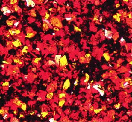
RECIPE
|
25.00% |
|
|
25.00% |
|
|
40.00% |
|
|
10.00% |
PIGMENTATION LEVEL
|
Pigment in wet paint |
5.5% |
|
Pigment to binder ratio |
26.1% |
NIR Reflectance
|
900 nm |
66.6% |
|
1550 nm |
72.5% |
|
Flop Index |
15.9 |
|
L [-15°] |
74.5 |
COLOR CHANGE
100
100
b
a
-100
50
-50
50
-50
-100

REFLECTANCE CURVES


Reflection [%] vs.
wavelength [nm]
15 °
- 15 °
25 °
45 °
75 °
110 °
AC 2722

AC 2722
Hot
Pepper
RECIPE
|
25.00% |
|
|
25.00% |
|
|
40.00% |
|
|
10.00% |
PIGMENTATION LEVEL
|
Pigment in wet paint |
5.5% |
|
Pigment to binder ratio |
26.1% |
NIR Reflectance
|
900 nm |
66.6% |
|
1550 nm |
72.5% |
|
Flop Index |
15.9 |
|
L [-15°] |
74.5 |
COLOR
CHANGE

MICROSCOPIC
PHOTOGRAPHY

REFLECTANCE CURVES


Reflection [%] vs.
wavelength [nm]
AC 2723

MICROSCOPIC
PHOTOGRAPHY

AC 2723
Purple
Power
COLOR
CHANGE
100
100
b
a
-100
50
-50
50
-50
-100

RECIPE
|
8.00% |
|
|
2.00% |
|
|
60.00% |
|
|
30.00% |
REFLECTANCE CURVES


Reflection [%] vs.
wavelength [nm]
15 °
- 15 °
25 °
45 °
75 °
110 °
PIGMENTATION LEVEL
|
Pigment in wet paint |
6.4% |
|
Pigment to binder ratio |
33.6% |
NIR Reflectance
|
900 nm |
45.9% |
|
1550 nm |
82.5% |
|
Flop Index |
17.0 |
|
L [-15°] |
46.6 |
AC 2723

AC 2723
Purple
Power
MICROSCOPIC
PHOTOGRAPHY

RECIPE
|
8.00% |
|
|
2.00% |
|
|
60.00% |
|
|
30.00% |
PIGMENTATION LEVEL
|
Pigment in wet paint |
6.4% |
|
Pigment to binder ratio |
33.6% |
NIR Reflectance
|
900 nm |
45.9% |
|
1550 nm |
82.5% |
|
Flop Index |
17.0 |
|
L [-15°] |
46.6 |
COLOR CHANGE
100
100
b
a
-100
50
-50
50
-50
-100

REFLECTANCE CURVES


Reflection [%] vs.
wavelength [nm]
15 °
- 15 °
25 °
45 °
75 °
110 °
AC 2723

AC 2723
Purple
Power
RECIPE
|
8.00% |
|
|
2.00% |
|
|
60.00% |
|
|
30.00% |
PIGMENTATION LEVEL
|
Pigment in wet paint |
6.4% |
|
Pigment to binder ratio |
33.6% |
NIR Reflectance
|
900 nm |
45.9% |
|
1550 nm |
82.5% |
|
Flop Index |
17.0 |
|
L [-15°] |
46.6 |
COLOR
CHANGE

MICROSCOPIC
PHOTOGRAPHY

REFLECTANCE CURVES


Reflection [%] vs.
wavelength [nm]
AC 2724

MICROSCOPIC
PHOTOGRAPHY

AC 2724
Aurelia
COLOR
CHANGE
100
100
b
a
-100
50
-50
50
-50
-100

RECIPE
|
6.00% |
|
|
1.00% |
|
|
2.00% |
|
|
1.00% |
|
|
15.00% |
|
|
75.00% |
REFLECTANCE CURVES


Reflection [%] vs.
wavelength [nm]
15 °
- 15 °
25 °
45 °
75 °
110 °
* Monastral™ pigments are not available in the USA
PIGMENTATION LEVEL
|
Pigment in wet paint |
12.2% |
|
Pigment to binder ratio |
61.1% |
NIR Reflectance
|
900 nm |
50.7% |
|
1550 nm |
81.9% |
|
Flop Index |
15.5 |
|
L [-15°] |
101.7 |
AC 2724

AC 2724
Aurelia
MICROSCOPIC
PHOTOGRAPHY

RECIPE
|
6.00% |
|
|
1.00% |
|
|
2.00% |
|
|
1.00% |
|
|
15.00% |
|
|
75.00% |
PIGMENTATION LEVEL
|
Pigment in wet paint |
12.2% |
|
Pigment to binder ratio |
61.1% |
NIR Reflectance
|
900 nm |
50.7% |
|
1550 nm |
81.9% |
|
Flop Index |
15.5 |
|
L [-15°] |
101.7 |
COLOR CHANGE
100
100
b
a
-100
50
-50
50
-50
-100

REFLECTANCE CURVES
* Monastral™ pigments are not available in the USA


Reflection [%] vs.
wavelength [nm]
15 °
- 15 °
25 °
45 °
75 °
110 °
AC 2724

AC 2724
Aurelia
RECIPE
|
6.00% |
|
|
1.00% |
|
|
2.00% |
|
|
1.00% |
|
|
15.00% |
|
|
75.00% |
PIGMENTATION LEVEL
|
Pigment in wet paint |
12.2% |
|
Pigment to binder ratio |
61.1% |
NIR Reflectance
|
900 nm |
50.7% |
|
1550 nm |
81.9% |
|
Flop Index |
15.5 |
|
L [-15°] |
101.7 |
COLOR
CHANGE

MICROSCOPIC
PHOTOGRAPHY

REFLECTANCE CURVES


Reflection [%] vs.
wavelength [nm]
AC 2725

MICROSCOPIC
PHOTOGRAPHY

AC 2725
Chameleon Gold
COLOR
CHANGE
100
100
b
a
-100
50
-50
50
-50
-100

RECIPE
|
0.50% |
|
|
0.50% |
|
|
4.00% |
|
|
5.00% |
|
|
90.00% |
REFLECTANCE CURVES


Reflection [%] vs.
wavelength [nm]
15 °
- 15 °
25 °
45 °
75 °
110 °
PIGMENTATION LEVEL
|
Pigment in wet paint |
8.1% |
|
Pigment to binder ratio |
40.0% |
NIR Reflectance
|
900 nm |
52.8% |
|
1550 nm |
22.3% |
|
Flop Index |
27.0 |
|
L [-15°] |
105.6 |
AC 2725

AC 2725
Chameleon Gold
MICROSCOPIC
PHOTOGRAPHY

RECIPE
|
0.50% |
|
|
0.50% |
|
|
4.00% |
|
|
5.00% |
|
|
90.00% |
PIGMENTATION LEVEL
|
Pigment in wet paint |
8.1% |
|
Pigment to binder ratio |
40.0% |
NIR Reflectance
|
900 nm |
52.8% |
|
1550 nm |
22.3% |
|
Flop Index |
27.0 |
|
L [-15°] |
105.6 |
COLOR CHANGE
100
100
b
a
-100
50
-50
50
-50
-100

REFLECTANCE CURVES


Reflection [%] vs.
wavelength [nm]
15 °
- 15 °
25 °
45 °
75 °
110 °
AC 2725

AC 2725
Chameleon Gold
RECIPE
|
0.50% |
|
|
0.50% |
|
|
4.00% |
|
|
5.00% |
|
|
90.00% |
PIGMENTATION LEVEL
|
Pigment in wet paint |
8.1% |
|
Pigment to binder ratio |
40.0% |
NIR Reflectance
|
900 nm |
52.8% |
|
1550 nm |
22.3% |
|
Flop Index |
27.0 |
|
L [-15°] |
105.6 |
COLOR
CHANGE

MICROSCOPIC
PHOTOGRAPHY

REFLECTANCE CURVES


Reflection [%] vs.
wavelength [nm]
AC 2726

MICROSCOPIC
PHOTOGRAPHY

AC 2726
Innate
Red
COLOR
CHANGE
100
100
b
a
-100
50
-50
50
-50
-100

RECIPE
|
45.00% |
|
|
5.00% |
|
|
5.00% |
|
|
45.00% |
REFLECTANCE CURVES


Reflection [%] vs.
wavelength [nm]
15 °
- 15 °
25 °
45 °
75 °
110 °
PIGMENTATION LEVEL
|
Pigment in wet paint |
4.9% |
|
Pigment to binder ratio |
23.2% |
NIR Reflectance
|
900 nm |
47.8% |
|
1550 nm |
86.4% |
|
Flop Index |
15.7 |
|
L [-15°] |
38.1 |
AC 2726

MICROSCOPIC
PHOTOGRAPHY

AC 2726
Innate
Red
RECIPE
|
45.00% |
|
|
5.00% |
|
|
5.00% |
|
|
45.00% |
PIGMENTATION LEVEL
|
Pigment in wet paint |
4.9% |
|
Pigment to binder ratio |
23.2% |
NIR Reflectance
|
900 nm |
47.8% |
|
1550 nm |
86.4% |
|
Flop Index |
15.7 |
|
L [-15°] |
38.1 |
REFLECTANCE CURVES


Reflection [%] vs.
wavelength [nm]
15 °
- 15 °
25 °
45 °
75 °
110 °
COLOR CHANGE
100
100
b
a
-100
50
-50
50
-50
-100

AC 2726

AC 2726
Innate
Red
RECIPE
|
45.00% |
|
|
5.00% |
|
|
5.00% |
|
|
45.00% |
PIGMENTATION LEVEL
|
Pigment in wet paint |
4.9% |
|
Pigment to binder ratio |
23.2% |
NIR Reflectance
|
900 nm |
47.8% |
|
1550 nm |
86.4% |
|
Flop Index |
15.7 |
|
L [-15°] |
38.1 |
COLOR
CHANGE

MICROSCOPIC
PHOTOGRAPHY

REFLECTANCE CURVES


Reflection [%] vs.
wavelength [nm]
AC 2727
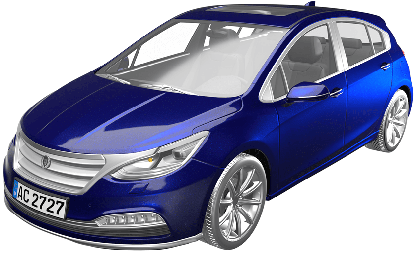
MICROSCOPIC
PHOTOGRAPHY

AC 2727
Midnight Gleam
COLOR
CHANGE
100
100
b
a
-100
50
-50
50
-50
-100

RECIPE
|
3.00% |
|
|
40.00% |
|
|
7.00% |
|
|
40.00% |
|
|
10.00% |
REFLECTANCE CURVES


Reflection [%] vs.
wavelength [nm]
15 °
- 15 °
25 °
45 °
75 °
110 °
PIGMENTATION LEVEL
|
Pigment in wet paint |
6.9% |
|
Pigment to binder ratio |
33.9% |
NIR Reflectance
|
900 nm |
52.9% |
|
1550 nm |
61.8% |
|
Flop Index |
24.8 |
|
L [-15°] |
40.5 |
AC 2727

MICROSCOPIC
PHOTOGRAPHY

AC 2727
Midnight Gleam
RECIPE
|
3.00% |
|
|
40.00% |
|
|
7.00% |
|
|
40.00% |
|
|
10.00% |
PIGMENTATION LEVEL
|
Pigment in wet paint |
6.9% |
|
Pigment to binder ratio |
33.9% |
NIR Reflectance
|
900 nm |
52.9% |
|
1550 nm |
61.8% |
|
Flop Index |
24.8 |
|
L [-15°] |
40.5 |
COLOR CHANGE
100
100
b
a
-100
50
-50
50
-50
-100

REFLECTANCE CURVES


Reflection [%] vs.
wavelength [nm]
15 °
- 15 °
25 °
45 °
75 °
110 °
AC 2727

AC 2727
Midnight Gleam
RECIPE
|
3.00% |
|
|
40.00% |
|
|
7.00% |
|
|
40.00% |
|
|
10.00% |
PIGMENTATION LEVEL
|
Pigment in wet paint |
6.9% |
|
Pigment to binder ratio |
33.9% |
NIR Reflectance
|
900 nm |
52.9% |
|
1550 nm |
61.8% |
|
Flop Index |
24.8 |
|
L [-15°] |
40.5 |
COLOR
CHANGE

MICROSCOPIC
PHOTOGRAPHY

REFLECTANCE CURVES


Reflection [%] vs.
wavelength [nm]
AC 2728


Reflection [%] vs.
wavelength [nm]
15 °
- 15 °
25 °
45 °
75 °
110 °
REFLECTANCE CURVES
100
100
b
a
-100
50
-50
50
-50
-100

COLOR
CHANGE

MICROSCOPIC
PHOTOGRAPHY

AC 2728
Black
Cherry
RECIPE
|
1st layer |
|
|
37.50% |
|
|
41.10% |
|
|
21.40% |
|
|
2nd layer |
|
|
50.00% |
|
|
50.00% |
PIGMENTATION LEVEL
|
Pigment in wet paint |
1.5% |
2.0% |
|
Pigment to binder ratio |
7.1% |
9.4% |
NIR Reflectance
|
900 nm |
63.5% |
|
1550 nm |
78.3% |
|
Flop Index |
18.3 |
|
L [-15°] |
40.3 |
1st layer
2nd layer
AC 2728

MICROSCOPIC
PHOTOGRAPHY

AC 2728
Black
Cherry
RECIPE
|
1st layer |
|
|
37.50% |
|
|
41.10% |
|
|
21.40% |
|
|
2nd layer |
|
|
50.00% |
|
|
50.00% |
COLOR CHANGE
100
100
b
a
-100
50
-50
50
-50
-100

REFLECTANCE CURVES


Reflection [%] vs.
wavelength [nm]
15 °
- 15 °
25 °
45 °
75 °
110 °
PIGMENTATION LEVEL
|
Pigment in wet paint |
1.5% |
2.0% |
|
Pigment to binder ratio |
7.1% |
9.4% |
NIR Reflectance
|
900 nm |
63.5% |
|
1550 nm |
78.3% |
|
Flop Index |
18.3 |
|
L [-15°] |
40.3 |
1st layer
2nd layer
AC 2728

AC 2728
Black
Cherry
RECIPE
|
1st layer |
|
|
37.50% |
|
|
41.10% |
|
|
21.40% |
|
|
2nd layer |
|
|
50.00% |
|
|
50.00% |
COLOR
CHANGE

MICROSCOPIC
PHOTOGRAPHY

REFLECTANCE CURVES


Reflection [%] vs.
wavelength [nm]
PIGMENTATION LEVEL
|
Pigment in wet paint |
1.5% |
2.0% |
|
Pigment to binder ratio |
7.1% |
9.4% |
NIR Reflectance
|
900 nm |
63.5% |
|
1550 nm |
78.3% |
|
Flop Index |
18.3 |
|
L [-15°] |
40.3 |
1st layer
2nd layer
SUPPLIERS AND PIGMENT CONCENTRATIONS
|
Supplier |
Product |
||
|
Pigment concentration in tinter |
Pigment concentration in mill base |
||
|
Sudarshan |
12% |
30% |
|
|
6% |
17% |
||
|
5% |
30% |
||
|
3% |
10% |
||
|
6% |
17% |
||
|
5% |
17% |
||
|
4% |
15% |
||
|
5% |
17% |
||
|
6% |
20% |
||
|
5% |
15% |
||
|
6% |
17% |
||
|
Hostaperm® Blue BT-617-D > |
4% |
18% |
|
|
5% |
20% |
||
|
4% |
15% |
||
|
5% |
20% |
||
|
10% |
30% |
||
|
20% |
60% |
||
|
30% |
60% |
|
Supplier |
Product |
||
|
Pigment concentration in tinter |
Pigment concentration in mill base |
||
|
14% |
n.a. |
||
|
STAPA® IL HYDROLAN® 2156 55900/G > |
14% |
n.a. |
|
|
14% |
n.a. |
||
|
14% |
n.a. |
||
|
14% |
n.a. |
||
|
14% |
n.a. |
||
|
14% |
n.a. |
||
|
14% |
n.a. |
||
|
14% |
n.a. |
||
|
14% |
n.a. |
||
|
14% |
n.a. |
||
|
14% |
n.a. |
||
|
3% |
10% |
||
|
14% |
n.a. |
||
|
14% |
n.a. |
||
|
14% |
n.a. |
||
|
3% |
n.a. |
||
|
5% |
30% |
||
|
14% |
n.a. |
* Monastral™ pigments are not available in the USA
SUPPLIERS AND
PIGMENT CONCENTRATIONS
|
Supplier |
Product |
||
|
Pigment concentration in tinter |
Pigment concentration in mill base |
||
|
Heubach |
12% |
30% |
|
|
6% |
17% |
||
|
5% |
30% |
||
|
3% |
10% |
||
|
6% |
17% |
||
|
5% |
17% |
||
|
4% |
15% |
||
|
5% |
17% |
||
|
6% |
20% |
||
|
5% |
15% |
||
|
6% |
17% |
||
|
Hostaperm® Blue BT-617-D > |
4% |
18% |
|
|
5% |
20% |
||
|
4% |
15% |
||
|
5% |
20% |
||
|
10% |
30% |
||
|
20% |
60% |
||
|
30% |
60% |
|
Supplier |
Product |
||
|
Pigment concentration in tinter |
Pigment concentration in mill base |
||
|
14% |
n.a. |
||
|
STAPA® IL HYDROLAN® 2156 55900/G > |
14% |
n.a. |
|
|
14% |
n.a. |
||
|
14% |
n.a. |
||
|
14% |
n.a. |
||
|
14% |
n.a. |
||
|
14% |
n.a. |
||
|
14% |
n.a. |
||
|
14% |
n.a. |
||
|
14% |
n.a. |
||
|
14% |
n.a. |
||
|
14% |
n.a. |
||
|
3% |
10% |
||
|
14% |
n.a. |
||
|
14% |
n.a. |
||
|
14% |
n.a. |
||
|
3% |
n.a. |
||
|
5% |
30% |
||
|
14% |
n.a. |
* Monastral™ pigments are not available in the USA
SUPPLIERS
AND
PIGMENT
CONCENTRATIONS
|
Supplier |
Product |
||
|
Pigment concentration in tinter |
Pigment concentration in mill base |
||
|
Heubach |
12% |
30% |
|
|
6% |
17% |
||
|
5% |
30% |
||
|
3% |
10% |
||
|
6% |
17% |
||
|
5% |
17% |
||
|
4% |
15% |
||
|
5% |
17% |
||
|
6% |
20% |
||
|
5% |
15% |
||
|
6% |
17% |
||
|
Hostaperm® Blue BT-617-D > |
4% |
18% |
|
|
5% |
20% |
||
|
4% |
15% |
||
|
5% |
20% |
||
|
10% |
30% |
||
|
20% |
60% |
||
|
30% |
60% |
|
Supplier |
Product |
Pigment concentration in tinter |
Pigment concentration in mill base |
|
14% |
n.a. |
||
|
STAPA® IL HYDROLAN® 2156 55900/G > |
14% |
n.a. |
|
|
14% |
n.a. |
||
|
14% |
n.a. |
||
|
14% |
n.a. |
||
|
14% |
n.a. |
||
|
14% |
n.a. |
||
|
14% |
n.a. |
||
|
14% |
n.a. |
||
|
14% |
n.a. |
||
|
14% |
n.a. |
||
|
14% |
n.a. |
||
|
3% |
10% |
||
|
14% |
n.a. |
||
|
14% |
n.a. |
||
|
14% |
n.a. |
||
|
3% |
n.a. |
||
|
Venator Materials > |
5% |
30% |
|
|
Viavi Solutions Inc. > |
14% |
n.a. |
|
* Monastral™ pigments are not available in the USA
Sudarshan Chemical Industries Limited
Registered Office
Eleven West Panchshil, 7th Floor, Survey No. 25,
Near PAN Card Club Road, Baner, Pune 411069 (India)
Board line: +91-20-68281200
This information corresponds to the present state of our knowledge and is intended as a general description of our products and their possible applications. We make no warranties, express or implied, as to the information’s accuracy, adequacy, sufficiency, or freedom from defect and assumes no liability in connection with any use of this information. Any user of this product is responsible for determining the suitability of our products for its particular application. * Nothing included in this information waives any of our General Terms and Conditions of Sale, which control unless it agrees otherwise in writing. Any existing intellectual/industrial property rights must be observed. Due to possible changes in our products and applicable national and international regulations and laws, the status of our products could change. Material Safety Data Sheets providing safety precautions, that should be observed when handling or storing our products, are available upon request and are provided in compliance with applicable law. You should obtain and review the applicable Material Safety Data Sheet information before handling any of these products. For additional information, please contact us.
* For sales to customers located within the United States and Canada the following applies in addition
NO EXPRESS OR IMPLIED WARRANTY IS MADE OF THE MERCHANTABILITY, SUITABILITY, FITNESS FOR A PARTICULAR PURPOSE OR OTHERWISE OF ANY PRODUCT OR SERVICE. 03/2023
™ Trademark
® Trademark registered in many countries
COA 1000 EN | 05.2025

HEUBACH GROUP
Marketing and Sales Coatings
Phone +49 69 305 39926 (Germany)
de.sales@heubachcolor.com
www.heubach.com
This information corresponds to the present state of our knowledge and is intended as a general description of our products and their possible applications. We make no warranties, express or implied, as to the information’s accuracy, adequacy, sufficiency, or freedom from defect and assume no liability in connection with any use of this information. Any user of this product is responsible for determining the suitability of our products for their particular application.* Nothing included in this information waives any of our General Terms and Conditions of Sale, which control unless agreed otherwise in writing. Any existing intellectual/industrial property rights must be observed. Due to possible changes in our products and applicable national and international regulations and laws, the status of our products could change. Material Safety Data Sheets providing safety precautions that should be observed when handling or storing our products are available on request and are provided in compliance with applicable law.
You should obtain and review the applicable Material Safety Data Sheet information before handling any
of these products. For additional information, please contact us.
* For sales to customers located in the United States or Canada the following applies in addition:
NO EXPRESS OR IMPLIED WARRANTY IS MADE OF THE MERCHANTABILITY, SUITABILITY, FITNESS
FOR A PARTICULAR PURPOSE OR OTHERWISE OF ANY PRODUCT OR SERVICE. 03/2023
™ Trademark
® Trademark registered in many countries
COA 1000 EN I 04.2023

HEUBACH GROUP
Marketing and Sales Coatings
Phone +49 69 305 39926 (Germany)
de.sales@heubachcolor.com
www.heubach.com
This information corresponds to the present state of our knowledge and is intended as a general description of our products and their possible applications. We make no warranties, express or implied, as to the information’s accuracy, adequacy, sufficiency, or freedom from defect and assume no liability in connection with any use of this information. Any user of this product is responsible for determining the suitability of our products for their particular application.* Nothing included in this information waives any of our General Terms and Conditions of Sale, which control unless agreed otherwise in writing. Any existing intellectual/industrial property rights must be observed. Due to possible changes in our products and applicable national and international regulations and laws, the status of our products could change. Material Safety Data Sheets providing safety precautions that should be observed when handling or storing our products are available on request and are provided in compliance with applicable law. You should obtain and review the applicable Material Safety Data Sheet information before handling any of these products. For additional information, please contact us.
* For sales to customers located in the United States or Canada
the following applies in addition:
NO EXPRESS OR IMPLIED WARRANTY IS MADE OF THE MERCHANTABILITY, SUITABILITY, FITNESS FOR A PARTICULAR PURPOSE OR OTHERWISE OF ANY PRODUCT OR SERVICE. 03/2023
™ Trademark
® Trademark registered in many countries
COA 1000 EN I 04.2023